Wherein Kali Makes a Bestiary

hey everyone, i’m back on my bullshit but this time with purpose

okay. so i decided that, for, reasons, i wanted to shake off the rust on my pixelart and monster design and animation skills. i haven’t seriously done anything with them in … years and i plan to be changing that, so practice was in order. and i do better when i have a format to work within, and i also need to find time to let myself have fun, so i decided to kill two birds with one stone.

which of course means i’m playing a version of Pokemon Black which has been hacked. it’s very much not the first time i’ve tried to make art based around that topic, i mean, … i’ve had multiple threads which i fell off of trying to do nuzlocke lets plays lmao. BUT! there’s quite a few things different this time:

  • i have neither a soul-draining job nor am i working on a math degree, at least one of which was always true during my other attempts
  • i’m not doing a nuzlocke or any challenge like that this time because as fun as they are they’re also work
  • all those previous threads forced me to really play a certain amount which also made it into work because i’m a bitch for schedules
  • no i didn’t need to tell you all of this but i need to prove to myself that this won’t fall apart lmao

anyway. so this one isn’t a let’s play thread this time. i just happen to be playing the game and using it as inspiration for what i’m doing.

as far as what i’ve done to the ROM, i randomized the shit out of it lmao. typing, movesets, evolutions, stats, abilities, trainer and random pokemon, field items … i’ve fucked up basically everything except what moves do because i need to be able to cling onto something as familiar. i also limited evolutions to still cap out as 3-chains, and i also made it such that pokemon evolve into things with similar stat totals to their normal evolutions - that way they don’t get weaker, or i would lose my mind and it wouldn’t be fun for this project or to play, lol

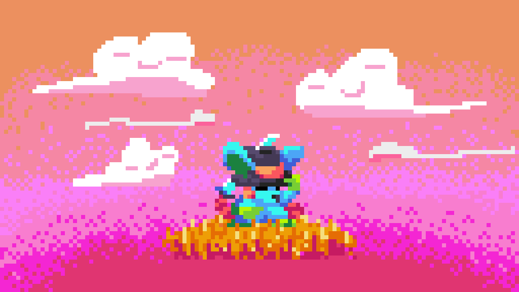
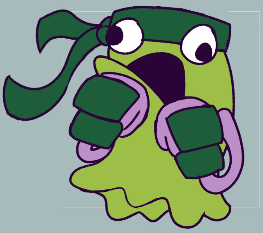
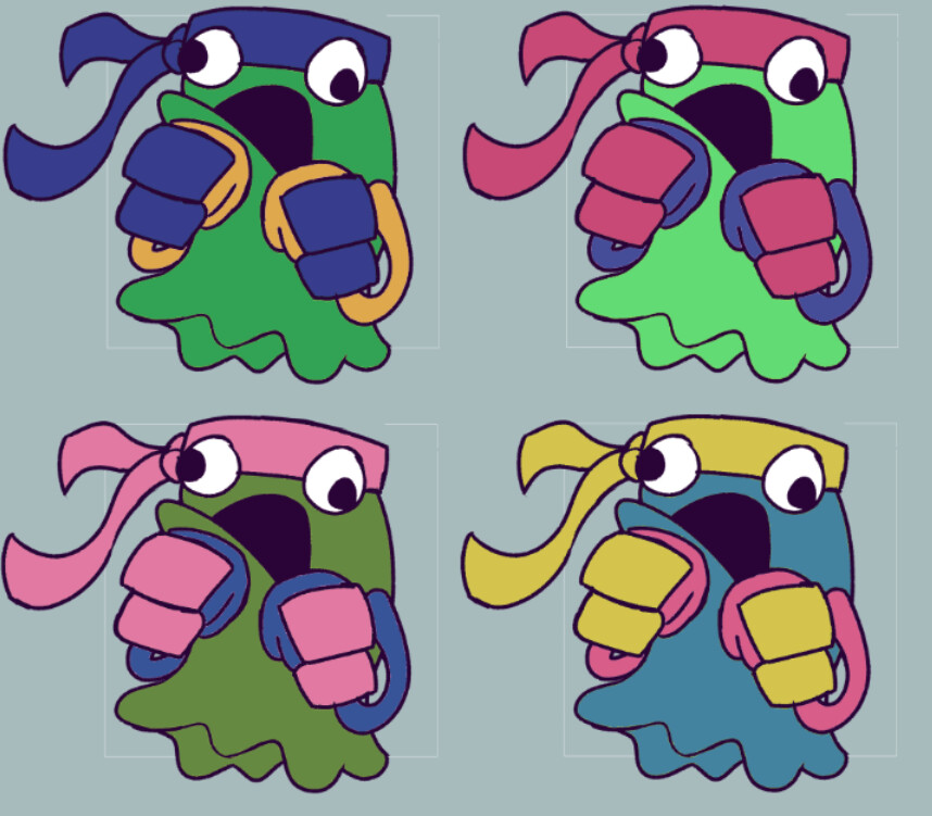
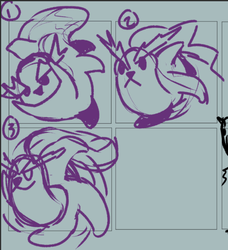
anyway. the goal is that once every other week, give or take, i’m going to be making an idle animation for a monster inspired by one of my Pokemon. i’ll be taking inspiration from really everything that does something for me - previous forms, the OG design of the pokemon, all of their mechanics. just whatever sticks out to me as a fun prompt. These won’t really follow in the style of Sugimori’s designs, because i’m just not interested in making that. my goal is for this to feel whimsical and silly like toriyama monsters, but maybe with just a bit more grit.

oh also i came up with a bunch of arbitrary specs and rules soooo

The Limitations

So first and foremost, I made a palette that all of these will be pulling from. It is 255 colors plus transparency, i shared my process making it over here: Share and talk about your visual art - #858 by Khan

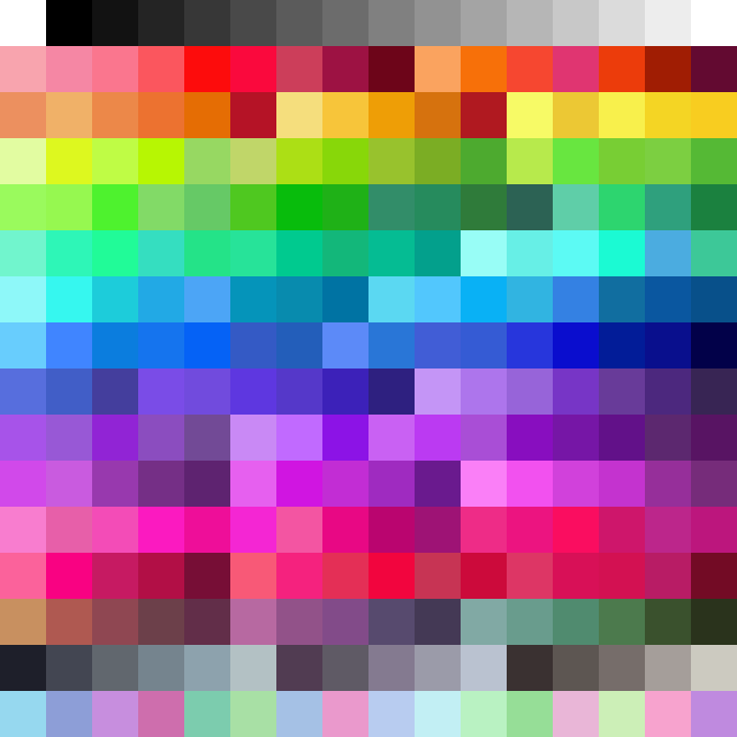
Every given sprite has a palette limit of 15 colors plus transparency per tile, each of which are going to be 8x8. and this is for the sprite’s whole palette, not just on display in a given frame - mostly because if i did that i would have WAY too much power and i would lose my mind more than i already have.

The size of a sprite will depend on its evolution stage. For three-stage pals, they start at 16x16, then become 24x24, then 32x32. For friends who don’t evolve, they’re 24x24, and for friends who only evolve once … ehhhh … it’s situational. i’ll figure it out case by case.

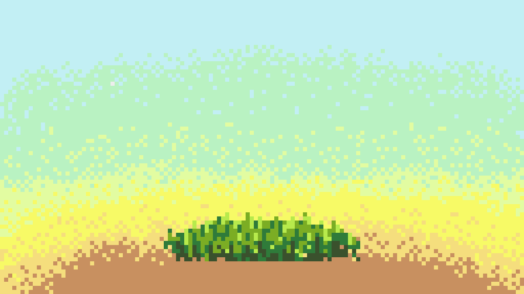
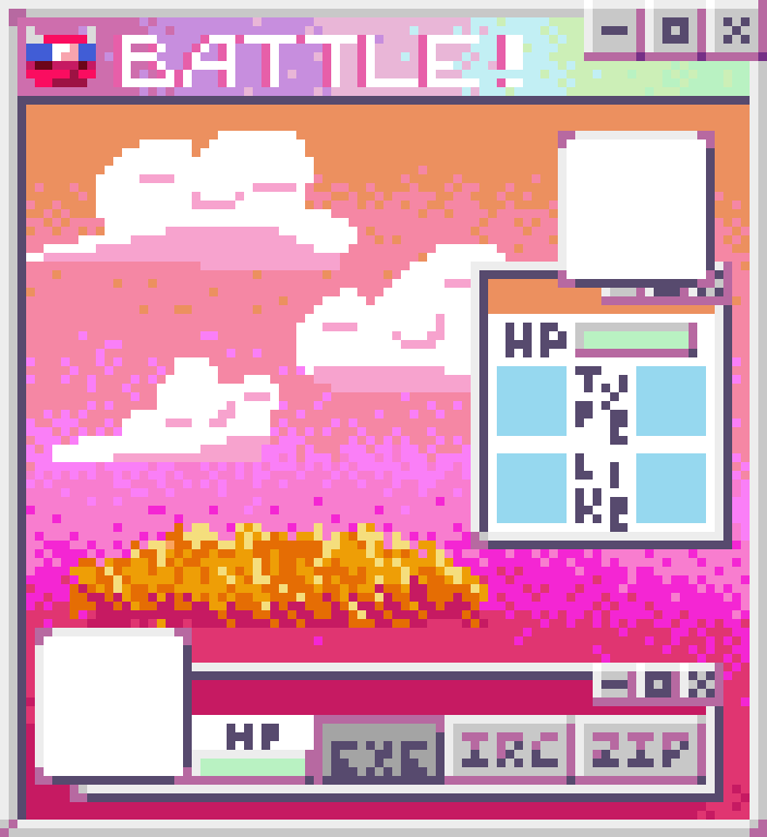
In the vein of pokemon, i’m going to have little stages/podiums that they are gonna rest on. while i don’t plan on making a game out of these dudes, and i don’t really plan on making mockups either, i still want to take this as an opportunity to freshen up on different assets. the stages are 6x2 tiles, or 48x16, but they only use the bottom few pixels of their upper row. this is intentional, so that when my lil guys stand on them they don’t feel like the ground is coming up over their head, but also so that there’s room for them to stand on it. and i’ve arbitrarily decided my final compositions that i’m posting to The Dreaded Bird Site are going to be 16x9 tiles, so that’s what my backdrops will be.

Even though these are just for their own sake and not for a game, i still want to think about thigns like their animations as serving a function. obviously, since the style of sprite i’m going for is some front-facing JRPG goodness, i don’t have to sweat it too much, and can go a little hogwild. that said though, i still wanna avoid overanimation, and am gonna do my best to keep things reasonable. i complain about overanimation in other people’s work constantly and i don’t want to be (too) much of a hypocrite.

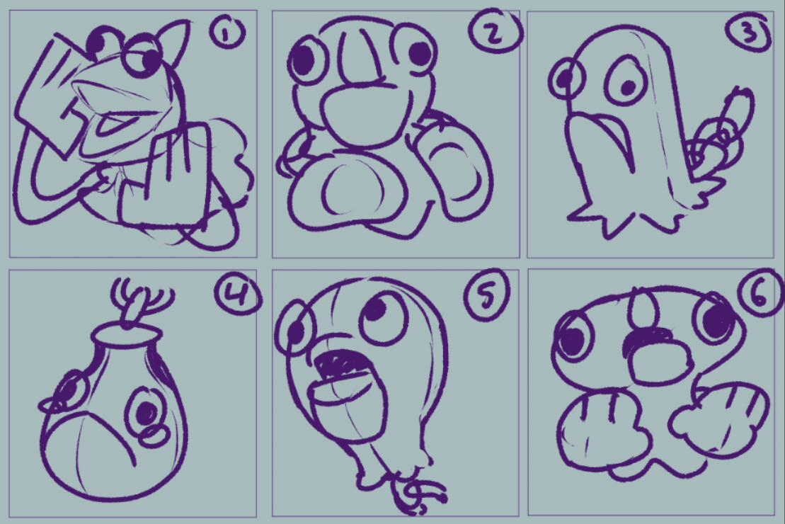
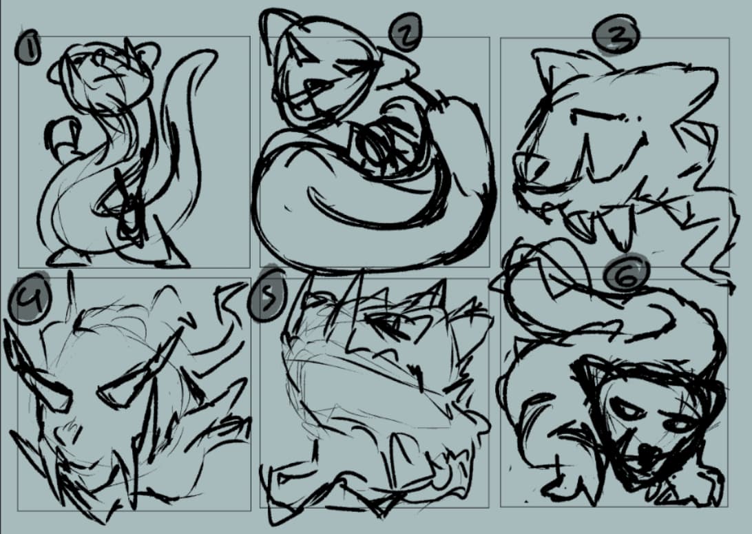
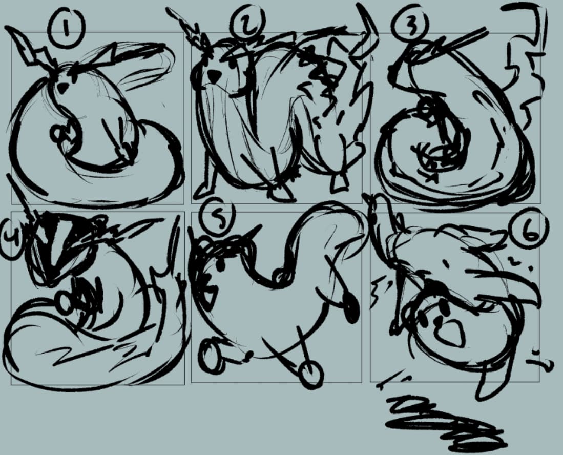
i think that’s all of my personal paramters for these. i plan to do a post with each one i complete, which will mostly work through my efforts from start to finish with a given friend because sharing my process is something i like doing and also it helps me internalize my own decision-making process.

also i already made the first one so i’m gonna start on that post … right now lol

18 Likes

Monster the First - Tympole, Psychic/Grass

So, here’s my starter. Despite what the numbers on-screen might look like, there actually isn’t a particularly large disparity between their base stats; or at the very least, not one big enough that it informed my design. Similarly, their ability and their moves didn’t play into my decision much here.

I did have an immediate idea based on their OG design and typing, though - tadpole tails are kinda like leaves, and their body was already an O R B, so i thought to make them a little eye buddy with a leaf dangling under them.

and ten minutes later, i had this:

Tympole_1

I will end up making some very minor adjustments to this, but it basically ends up being the first frame of their idle, and is definitely their design. i’m particularly proud that their eye and leaf are pretty well split over the mid-line of their upper and lower tiles, so until animations get wilder near the end, their palette stays pretty clean.

Tympole_Anim_Sketch

So this was my first sketch of their animation. There’s a few problems with it, but i do actually stick to its general outline. most notably, my issues were:

  • the leaf doesn’t wiggle well enough, it spends too much time bent back. looks like it’s dragging in the air, when i want them to look like they’re floating.
  • they move way too fast. i want them to feel maybe a bit on edge, but i still want them to feel kinda floaty.
  • that bit where they crash down to the left hits too hard for the kind of animation i wanna end up having.
  • why do they have four loops of their normal animation and THEN the special one where they have psychic power stuff happen? it feels wrong.

Tympole_Anim_Sketch_2

So, i’ve fixed a few things here, but it’s still far from there for me. on the positives, the leaf waggle feels more natural, and the base loop plays 3 times before the special animation. The bit where they dive down to the right still feels a bit too punchy, and also like it stops short - if they’re floating, they should kinda glide past their destination. Also, regrettably, while i wanted to keep framecounts down, this just feels way too choppy for what i want.

Tympole_Anim_Sketch_3

At this point, it’s getting fairly close. i added a bit of leftward glide to the first bit of their loop, and when they dive down to the right they now scoop back up and keep floating. it makes them feel a hell of a lot lighter. however, there’s still a few little flaws that i noticed, soooo …

Tympole_Anim_Sketch_4

right, so the adjustments here are fairly minute, but i think they did a lot. so firstly, when they drift down to the right, they actually dip below the tile line now. (you can tell it pretty clearly with this background, since this checkerboard patter is across the tiles to help me keep track of them). additionally, i realized that a lot of their secondary animation finds them about a pixel too far to the right, so i pulled all of them over to the left to feel less jittery.

and from there, the sketching is done! so, i started to go frame-by-frame coloring these in, and making adjustments to the specific pixels of the silhouette from the sketch as i went. here’s what that first pass came out like:

Tympole_Anim_WIP

so i didn’t use any onion skin when i colored these, and it definitely shows lmao. some of the lower highlights in the eye look a bit wonky in motion, a lot of the shading in the upper eyelid seems out of whack, and the pixels in the leaf just kinda shift willy-nilly. so let’s fix that!

Tympole_Anim_WIP_b

great! so now i can get to work on the secondary animation. the idea is for their eye to shift colors outward from their pupil while colorful effects flutter around them. basically just an excuse to showcase the palette and make them look like they’re doing psychic powers. in particular, the eye effect was inspired by what i remembered the crit animation for Mogalls looking like in FE8: Sacred Stones.

with the scrunching-up portion of the animation, all of the colors from the leaf end up entering into the upper tiles, and all 15 colors up there are taken up. but i still have a few spots left down below! So i go ahead and add in some blues into the effects in the bottom tiles.

I also end up doing two passes of this, first was:

Tympole_Anim_final

my issue with this though is that because so many of the sparkles hit the wall of the sprite’s tiles, you can very clearly tell that they’re in a box. and i’d rather avoid that! so i tried to smooth it out a lil bit:

Tympole_Anim_final_a

and that’s their animation! so now let’s talk about making the first set of background assets.

since they’re my starter, i decided to make elements for a plains first. i didn’t want to do a town, and we’re not really in a forest although there are trees around. also, this means i won’t need to do new elements for at least another sprite or two.

so first up, i did this gradient for the background. it’s only using 6 colors, and uses some REALLY loose dithering. i wanted it to have a bit of a sunset type of feeling, because i knew i would have a lot of good pastel picks to make it soft.

up next we have the grass stage. it has a three-frame loop, which goes 1-3-2-3, with variable amounts of lingering on the 1. so it doesn’t feel like it’s being hit by an intense gale, but maybe by a bit of a breeze.

Grass_and_BG

and finally, some cute little clouds! they actually ended up having a lot more frames than i expected, i think it’s like … 5? maybe 6. either way. they also have variable amounts of hangtime, favoring their starting frame.

Grass_and_Cloud_ and_BG

then all that’s left is to slap our little friend in and this is done! a thing i forgot to say in the first post is the difference in vertical placement between floating and grounded monsters. grounded monsters are going to be placed overlapping the upper tile of the stage, while floating/flying ones will be placed a tile higher than that.

and again, the placement of all of these assets together in this way isn’t for a mockup or anything, though i think you could pretty easily keep it like this if you didn’t show the player their friend and slapped your UI on the bottom and some on the sides. anyway.

here they are, in context!

Tympole_For_Posting

35 Likes

oh this rules

1 Like

With how cute those clouds look you should probably make a cloud monster at some point as well.

2 Likes

har, i might! depends on how my flying types go, but i’m not opposed to having a buddy who is a cloud

a friend also had the idea that maybe i should put little

.       u        .

faces on the clouds, which i might go for. i could give em little facial expressions for different times of day or weather, even. would help up the whimsical level

2 Likes

so i’ve actually been working on the next entry of these throughout this week! this one came out pretty fast. but first - I’ve made some slight adjustments to my fake hardware limitations.

All sprites are now contained in a 40x48 pixel (5x6 tile) frame, where grounded sprites take the bottom 5 tiles and flying ones the top 5. This both makes it easier for a given sprite to be “drawn” onto the field, and also grants me a little leeway. Now i can treat my rules (like 16x16 for the first of 3, etc) as softer guidelines, and allow animation frames/sprites in general to poke out slightly as necessary. this ALSO is a tile larger than my previous largest, which was 32x32, because i want the biggest sprites to be, well, bigger. I want them to really feel like big monsters.

Also, i did end up drawing faces on the clouds from the last friend’s background:

Tympole_For_Posting_cl

Anyway, onto the new friend!

Buddy Number II - Nincada, Normal/Steel

This one is gonna be a really good example of how loosely I’m using the Pokemon and their mechanics as inspiration, I think. So i … super did not want to do a friend shaped like or even a little visually inspired by nincada themselves. just was not fucking with it. but i did take the inspiration that they should be a little guy, and since they’re a normal type, i decided to run with making them a rodent-type-pal. they also have that ability Trace, which to me meant that they should look a little dorky. and once again, no noteworthy stats to me

in the process to come up with a design for this one, i also went ahead and considered their evolutions - after all, nincada evolves into two pokemon at once, and i needed a way to work that. Obviously in the original games, nincada evolves into an adult cicada and an empty shell, but that isn’t gonna work for this buddy. the shedinja replacement is a ghost type (who evolves AGAIN afterward), and then there’s nincadas proper evo, which is a poison/dragon type. so i’ll show you my early sketches and then talk about my thoughts:

i took the design process on this one fairly loosely - i didn’t work on silhouettes much, i didn’t explore a lot of variations, i don’t iterate much. i was mostly just trying to sift through a few ideas in my head and find the one that i liked.

my main ideas were:

  • a beaver with metal teeth and a tail who’s got a pencil and is surveying the land/their opponent. their offshoot pokemon would be some kinda nature spirit from the fallen logs left in the beaver’s wake, and the poison evolution for the beaver would be like, a pollutant dragon
  • mouse with a sword, my first idea was to give them glasses. but there’s apparently an australian rodent called a Bilby which naturally made me think of trilby and well, here we are lol. their offshoot could be like, a spirit in their sword or something similarly edgy; i didn’t have a strong idea.
  • a lil marsupial with a phone or other gadget that they kept in their pouch. when they evolved theyd have more like, tech dad energy and their joey would be their offshoot.

out of these, i was mostly feeling that bottom row. i like the standing trilby bilby, i REALLY liked the sword-tail idea, and i thought the phone pouch was hilarious.

So i basically just went and punched up the shapes and JRPG-battler posing of those designs and slapped some quick colors. what i walked away from this with was -

  • its gotta be the hat mouse its too good
  • i really like the joey evolution idea so i should add in the marsupial pouch
  • standing on 2 legs is better but i should do the sword-tail thing

again this is hardly what a rigorous design process looks like, even for me who loves shortcuts, i was just trying to get on something that i could be happy with

so i tried two different last passes at shapes, and decided that i like just rat and hat, keep it simple. also those classic video game rat cheeks. so basically from here i did one more drawing which added … well nothing lmao but i felt like i needed a cleaned up doodle. i honestly HATE it (and most of these doodles, i hadn’t warmed up or anything) but it helped get my thoughts fully in order:

cemented a few shape and pose decisions with it -

  • there should be a handguard on the tail
  • there should be soft tufts of torn fabric in the hat
  • front hand should be holding the hat

things i end up not sticking with from this are the hand in the pouch and the oddjob bladed hat, just wasn’t the vibe.

So the sprite moved … very quickly lmao. i start off trying to do 16x16, before immediately realizing “yeah no this thing is too detailed for that”:

Nincada_16

you can tell i gave up quick, because there’s still some of my black sketch pixels under it lol.

fortunately, they technically only evolve once, since i’m considering their offshoot more like their child, so i can make them 24x24 and be within my own guides still. heres my first attempt at that:

Nincada_Pass_1

this motherfucker SUCKS lmao. here’s all my issues with it -

  • boring proportions. push it more, make it more cartoony.
  • too much dithering and texture in the shading, its just busy and it also doesn’t feel in-style.
  • look at these awful colors! a color and its shades should NOT be so close together, and the shadows should NOT be that desaturated. that shit just does not read with pixelart and it feels kinda lifeless, which is very counter to what i’m going for with this project
  • the whiskers are too noisy, 86 em

so i basically completely reworked it:

Nincada_Pass_2

and here’s my first pass at that! redrew a lot of it, reselected a lot of the colors. it feels a lot better, but i still have issues with it:

  • that green shadow color is too desaturated, i’m not feeling it. its also too close in saturation and shade to the blue shadow, which makes them have that bad fuzzy feeling on the edges.
  • the edge of the hat almost feels like its an outline around the hand, and i hate it
  • the tail is too thin, and feels out-of-style
  • the sword’s shading is way too complex
  • i don’t want it to be so obvious that the hat and tail are the same colors, so i want to pull in that third color that the cheeks also use to make it feel like a different tone. contextual colors is everything baybee

and a bit of work and rework later, i landed here:

Nincada_Pass_4a

all told, it took about an hour to go from starting the first sprite to getting this one. now to start animating! this is what i did kinda leisurely across the week.

unlike the last bud where i went and animated them straight-ahead, going back and adding frames when needed, i wanted to keyframe this pal a little. want that tail swaying, and i want them to pull the hat down then tilt up. so i did 3 keyframes total including that first we alreayd have:

idle_animating_keyframes_1

and i basically don’t touch these frames, i’m really happy with them. from here i slapped down the frame hold that i wanted for the body, while slapping in some rough ideas of the tail’s animation

idle_animating_keyframes_2

then i smoothed out the first few frames of the body, and slapped in some smear and other adjustments to smooth out the tail:

idle_animating_WIP_1

then i smoothed out the rest of everything, and added some more hangtime to after the smear to feel punchier.

idle_animating_WIP_2a

then i went ahead and made a recolor of the previous BG, changed the cloud faces, and added a foreground element to the grass to make them feel grounded! and that’s that.

Nincada_For_Postingc

22 Likes

also i put this together for fun to visually represent how tiny the sprites are for this project, and show just how much you can get from a little:

so in that first row we have:

  • our pal from last time, my starter, who fits within 16x16 on all of their frames and is i believe something like maybe 10x15 in their first frame? haven’t counted that.
  • the slime from dragon warrior 3, who is 15x16 here.
  • our new friend! they are 22x24 in their first frame, i believe.
  • bulbasaur as depicted in G/S. they are a little over 30px in both directions! that makes them bigger than most of our monsters, kidna by default

then on bottom we have:

  • a square representing my new 40x48 frame for sprites. recall that 8 of those vertically ACTUALLY go untouched, and that this is after me increasing the maximum sprite size by 8 pixels both ways.
  • because despite that, kangaskhan from G/S is still bigger! they hit the borders of the 56x56 pixel sprite limit that those games had. meaning they absolutely dwarf our biggest friends.
  • but in black and white they’re even bigger, most notably much wider. and, they’re much further from the max size in this game, a whopping 96 pixels in both directions

anyway. it’s fun to visualize just how tiny these little guys i’m making are, but still how much you can pack into em

10 Likes

image

5 Likes

Do you know if they stay within these limits even when they’re tweening their limbs around like the tried with that gen?

1 Like

i hadn’t considered that! i went and looked into it and it turns out they don’t stay in the limits for that, actually! only with their base frames. for example, pokemon white 2’s Kyurem White exactly hits the horizontal borders in its base frame, but during its animation grows to over 100 pixels wide! kind of a shame that they don’t commit.

2 Likes

Alright! its been two weeks and i have an update which falls out of the planned norm. i have made some exciting progress and i do have a bunch of images and gifs to show a process, but this time it’s not for a lil pal! these past two weeks i’ve been slowly working away at some faked UI elements. i’ll get into why and how with the post, but know that i ALSO spent a lil bit of time getting through most of the initial design work for the next lil monster, who will be a nervous muppet with ryu gloves! so look forward to that in 1-2 weeks time

oh also this project is called File.Frnds now

File.Frnds - The GUI Interlude


right, so to start, why? well, truth be told, i wanted to practice making UIs a bit, and this whole project exists for me to practice different skills. so it works! but also, i was dissatisfied with my strategy for the final gifs - 16x9 tiles was something i decided on a whim for posting to twitter, but they don't crop gifs, so i don't actually have to worry about that. and the 16x9 just felt like an awful fit for the genre and scale i was working on.

So, i first had to decide on my screen resolution for my “hardware”. a friend suggested stealing the rez from the Neo Geo Pocket Color. i liked this idea, if for no reason other than i like that lil handheld friend. buuuuut 152x160px (19x20 tiles) was just way too big for my sprites. (reminder that my friends are, at absolute biggest, 5x5 [or 5x6, maybe, if theyre grounded and i decided to go for it], and i will NOT be making back sprites or anything like that, so there won’t be a pokemon-esque faceoff either) BUT, i still liked the idea of the screen being just slightly not square.

sooo, what i ended up landing on was going 11x12 tiles. that keeps the screen pretty snug around the enemy sprite, but leaves plenty of room for UI fluff. before i got to work on any GUIs though, i wanted to make sure i felt okay about the screen size! so here’s that with some assets from last update:

so obviously the new color at the bottom needs some dithering, but i feel pretty good about this scale! onto starting to mockup GUI things. they’re going to play off of my original idea for the visual style of this thing - i want it to feel very internet, specifically an internet that we, no longer have. so i’m taking influence for these mostly from the windows 95 UI. here’s my first attempt at a window for the whole screen:

this is definitely a start, but i also definitely have some problems with it. i like the idea of having the bar at the top have a little gradient, keeping that idea. and that little buddy for the icon is supposed to be a like, horned lil dude with a naruto headband? type deal? it doesnt come off great here but, i like the idea. anyway other issues are just some things which aren’t true to how 95 look that i want to fix, and also all gray feels boring.

okay! so. the big window is a lot better. gives it more presence, lets the icon have more detail. i still don’t know how i feel about the little dude, but he’s good enough imo. also as you can see i’ve added in the shadows that windows 95 UI had on the inner left and top and outer right and bottom. though the latter isn’t visible on our big window because its taking up the whole screen! i also replaced the shadow gray in the windows with a purple to give them more life and also more of the energy i want the visuals to have. no reason for the UI to be blander than everything else!

you can also see i’ve started on the enemy UI window. i’m really happy with the smaller versions of the minimize/maximize/close buttons and the window pane in general. the HP bar you’ll see get fiddle with a bit. what i’d like to draw attention to tho is that their window color has been dictated by the upper color of the background - the player will have the same thing for the lower color. i decided on this so that 1) they have that extra bit of driving home that enemy is up, player is down, and 2) it makes the windows feel responsive to the background you’re fighting on, and i like that.

i guess i should also cover my idea for the UI layout here. i shifted the enemy left (though i’ll be shifting them a little more later), and then their windows are on the right. the player windows will be along the bottom, and they’ll have a smaller window on the left. both the enemy and the player will have little 2x2 tile minimugs of their .Frnds, which does mean one extra thing to do for all these little dudes, but i’m fine with that. that way the player can still tell who they have out!

also as far as battle options, in the end there will be 3 - .EXEs, which are attacks, IRC, which opens a chat with the enemy, and .ZIPs, which are gonna be how you “catch” them with filetypes like .zip, .7z, and .rar

fortunately this is all an art project so i don’t have to think about gamedesign at all lmao i don’t have to make this shit work

so here is the next iteration! moved everything over a little more, added in the window for the player and for both minimugs. various things are still gonna move around at this point but its getting there. the HP bar has been changed up a little, and i’ve decided on the information to add - typing and their “likes”. one helps in battle, and the other essentially acts as their “types” for chats. which, speaking of,

here’s what that window looks like. note that it covers up part of them if they’re floating or bigger than 16x16, which is part of why the enemy has a minimug. also note that they cover up the HP and type, because those no longer are relevant information, but their likes are still visible, because those ARE relevant. also those little gray squares are markers for my font. oh right i made a font

Font

it’s 6x6 which means there’s no center so everything’s a little wonky, but i like the energy. also you’ve already seen this font because it’s what the BATTLE! up top is written in, albeit with a slight extra detail of the drop shadow. i’ll definitely need to add a little downward-pointing arrow element or other such thing at the bottom right of the window to indicate a need to click to continue. i also might see about actually extending it up another row, or maybe pushing down the enemy window to make room for a row below. just cause thats not a lot of letters on screen at once rn cause of my miniscule resolution. either way i didn’t do anything with that this time, this GUI stuff is technically unfinished even after this update, but its good enough to do another few friends first.

anwyay moving on,

this is the next big update. it might not look it but pay attention to the background here - i’ve re-dithered the new additions, as well as adjusting the positioning of my clouds (which also meant getting rid of the smaller ones as i no longer need that space filling they were doing for me) also i adjusted the enemy minimug. it was too far left! (also i keep calling them minimugs but not only will these be the only mugs, theyre probably gonna be intense closeups and not even minimugs so its wildly inaccurate to keep calling them that lmao)

here it is sans-clouds but with the panel i have for sprite scale to show what the biggest sprits will look like here - just absolutely dominating the screen. this is good.

GUI_Animation_Cloud_Magenta

and then here’s my first animation of it. i adjusted every frame of the clouds to work in this new space, and i added some float to the UI. i end up deciding this is way too fast and slowing down this float, but i do like them moving.

from here, i turned to focus on the player menu -

we have our three buttons, and an HP bar for your friend. from here, i made a cursor, and then made an animation showing off the new float and some button clicks! i’m really happy with this, and i think its gonna help a lot with the presentation of this project moving forward. also it was just good practice with flavorful UI mockups.

GUI_Animation_plus_cursor

12 Likes

Alright folks it’s been two weeks and here i am once more to give you those Good Good lil buddies

Friend Número Tres - Shuppet, Grass/Fighting

Unlike our last .Frnd, this time i actually do wanna take some close inspiration from the original design, though in a different way. So Shuppet and their evolution Banette are obviously inspired by puppets and dolls, (speicifcally teru teru bōzu in the case of Shuppet) and i wanted to keep that, but change the puppet inspiration. So instead, my major influence came in the form of Muppets.

Also, statistically, they have good defenses and speed but bad attacking stats, so i wanted to represent that by making them scared to fight, despite being a fighting type. And i had the idea that their “Snow Warning” ability could be represented by snow constantly falling from underneath them. None of their moves in particular here spoke to me, so my design didn’t pull from those.

So here is my first set of designs! I’m definitely getting more and more back into the groove of, well, everything, the more i work on this project, which is great for my self-esteem, hah. I tried out a lot of things here, working in lots of different muppet face shapes, as well as playing with different ideas for how to make the body “fighting”. 1 and 6 have those big hands, while 2 has got hand-held punching pads, since they’re defensive. with 4, 5, and 6, i was playing around with the idea of them being a bag - a heavy bag in the case of 4 and speedbags for 5 and 6. i honestly think a lot of these ideas are pretty cute and could go somewhere if they got worked on. but! for this buddy i moved forward with 1 and 4 as my new bases.

so for my next pass i originally did two more ideas based off of each. i think 4 in particular is really cute and pathetic, but in general at this point i knew i preferred the muppet body. with 1 you can see me going for a sort of muppet babies energy which i promptly threw in the garbage, even though i secretly love it, mostly because this .Frnd will only evolve once and i want them to not feel so infantile in their first form. 4 is on more of the right track, but i wasn’t really feeling the kermit head, so i went ahead and then drew the two you can see on the right, where i took influences from the martians and beaker, respectively, for the mouths. none of these poses end up staying, but i actually really like the pose in the bottom right, it gives me those good good JRPG monster feelings like they’re just perpetually stuck in action

so my next phase, i felt like i preferred the long mouth over the kermit one, just cause it had more anxious energy, but i wasnt for sure, so i did a few more of both. you see here that i commit to the arms coming off of the sides, i dont know why i originally drew them coming out from underneath, but it definitely looked a bit weird to me. you also can see that i commit here to the idea of them having some gloves and having their arms up in an almost- universal block sorta deal. that pose in the top left ends up feeling the most right to me, but i really liked the headband and wanted to play around with it and the gloves.

so now, a refining pass! i took that pose and decided to JUST play around with a few basic things - where the arms go, what the gloves are, what the headbands like. i tried quite a few ideas, some more like boxing gloves, some with things like spikes, etc, and in the end i decide to just roll with some chunky MMA-esque fingerless gloves. as far as bandana, while i liked the idea of a cute shapey little bow, i end up keeping simple and just rocking the ryu-sorta bandana that 6 has. ive had a lot of practice in the past animating things like scarves n whatnot, so i feel pretty comfortable with it, and i like the look.

so here’s one last little refined drawing to test some colors and make the pose a little bit stronger and just combine all of my elements together. this palette is a little bit TOO simple, so i try a few other colors:

i like some of these and some of what theyre doing, but none of them are quite right. at the very least though, ive got an idea of where my palette will land, so from here i go to the pixel zone!

image

so i pulled up our little mouse friend next to them while i worked, since even though i’ve got my tile grid marked out underneath them, i still wanted a more tangible comparison at hand. as usual, i start by taking about 10 seconds to just scribble in black to get my shapes down, and then i filled in with some ideas for colors.

naturally, those colors get pushed around a bit, and we end up here. This is pretty consistent with the original sketch, and i think its a good starting place! though i’ve got a pretty healthy list of problems with it:

  • there needs to be another shadow color for the main body, its literally the biggest shape and the main shape, it should not feel this flat, especially when other things have third shadow tones.
  • obviously just in general shading needs more attention, a lot of pixels need to be pushed. there’s that right angle formed underneath the eye on our right side, there’s some light pixels on the ousides of their gloves which should be a shadow tone to make them feel rounder.
  • all of the colors have gotta be re-assessed. the shadows are too close in color and saturation to their base tones, it feels bad. pixel shadows should like, almost (i cant think of a situation where i think its better to do otherwise, but still, aint nothing absolute) always be changing in saturation or color tone compared to their base tones. they just feel so much more alive and they read so much better!
  • they’re too big, by like a few pixels each way. the arms peaking out of their border or their bandana peaking out is fine by me, but their body should fit in a bit better imo.
  • the shadow in their mouth needs something different than that purple, it reads weird with the bandana in the background.

So here we are, all those changes made! the greens move towards blue, the blues move towards purple, they’re a lil smaller. that snow is gonna go away soon cause i wont try animating that til near the end.

you can also see here my first tries at mugs for these two! i love the muppet mug, its perfect, but i hate the mouse one. gonna redo that later. (i actually completely redo it twice in the end, but im happy with the final result)

so onto animating! with this one i decided i was going to do an 8-frame loop, and that they were going to float up and down. so i quick got that laid out, and then started blocking some basic movements in, one at a time. First, the bandana and making their bottom twirl:

idle_animating_WIP_1

Then, their mouth going “meep meep” and their eyes darting around. the trail behind their pupils is the gray of their inside, since its a little lighter than the black of the pupil so it reads a little better as a motion blur. and the trail itself is just a line between its new position and its old one, but ignoring the pixel it was originally on. makes it snappier than when its included.

idle_animating_WIP_5

from here … i struggled for a long time to work out an arm animation that i liked. i know i wanted them to move, at least to bounce a little bit, because i it would just look bad if their arms were glued to their side. what i end up with is them putting up that block from before, hiding behind their hands -

idle_animating_WIP_6

but this was missing something. (also at this point i realize that i dont actually want that shoulder on our left to be totally covered in that darkest shade, so don’t worry, that frame gets fixed.) what i end up doing is replacing the first frame of the hands being up with a frame that has a bit of overshoot and squish, just to sell the motion of the hands slamming together better. (also i dont fix that arm just yet, that isnt til the very very end)

idle_animating_WIP_7

from here, i just fix up some pixels that were still bothering me, i actually adjust a few of their colors, and i add back in the snow!

idle_animating_WIP_fin

so from here, it was all onto our background and UI for the final mockup image for me to post to The Bird Site and get like 5 likes on or whatever

this friend is still just caught in the normal outdoors, so i’m still just recoloring that background we’ve been using. i’ll make a new one when i damn well feel the need, lol. I decided to make it a weird nighttime type of feel. i added in our mug, as well as the final mug for the mouse, and also made a decision with those. when i put them into the scene, i realized that they needed a bit more of a border or they felt kinda odd? so now they’re actually 14x14 pixels, with a 1px-wide white border around them before their window sprite surrounds that. Otherwise, i made a few little icons, made some minor changes to the UI windows from last update, and put it all together! really proud of them.

Shupp_Postin

19 Likes

meep meep

2 Likes

Love this thread so much. Great work!

2 Likes

i was really hoping you’d go with the martian look as i read through this, and i;m glad you did!! i love those little fuckers

this rules a bunch

2 Likes

Thanks! a big part of me continuing to have the energy to do these is definitely the love y’all have been giving for em. and i really wanna keep doing em, cause i’ve got a lot of ideas of things i wanna try to pull off (especially on the UI mockup end)

the martians are very very good. top tier muppets. i do think that the final friend has a mouth like, somewhere more in the beaker zone than the martian one, but there’s defintiely SOME martian in there. originally (by which i mean before it was like, the final day of my self-imposed 2 week period and i still had spriting to do) i was planning to have an extra animation that played where they did the like, muppets slamming their mouths shut thing, that would maybe play once every 4 or 5 loops? i dont know how else to describe it but its the thing where the puppetteer makes a fist out of the hand which is operating the head, and it makes the face go funny and the mouth slam shut. uhhh like this kermit

image

or like when the martians get scared

image

but i just ran outta time unfortunately! had other stuffs goin on in the past 2 weeks


uhh also gonna share a few updates on this whole project from my brain zone, just about what i’m planning to do with the next few pals to get it jotted down somewhere. the next friend is going to be an angry little electric ball of hate who will eventually evolve into a cool punk ghost

after them, i’m going to do a design i’ve been waiting to play the game a little more to get to. One of the first buddies who joined my team learns some moves at level 15 that i want them to learn before i design them, because they are important to the idea for their design that i have.

and then after THAT, i’m gonna go back and redesign our starter. I didn’t actually give them a design, and i basically just reskinned Tympole’s silhouette to fit the types better. I have a better idea of what i want to do with them now, and the project itself has come into its own a lot more as far as finding a sprite style, finding the kinds of designs i wanna have. i mean hell even just having the new name and the UI reframed it a lot in my mind compared to the start. so i just wanna get them up to speed!

i don’t know what exactly i’m doing after that, but i mean, thats the next 6 weeks of this thing, unless i end up speeding up the rate i do these at. Which, maybe i will, depending on how life goes.

what i will say is that i haven’t actually picked up and played my ROM in a minute, there’s like 5 friends who i’ve caught that i haven’t mentioned designing, and the plan is to basically, well, not design them. not because i don’t have ideas, but mostly because i wanna get back to slowly playing the game and continuing to run into more friends, and just doing designs whenever a friend speaks to me. and all the ones who i’ve got around can basically be backups for if i don’t have any new friends inspiring me for a given week. i could probably do fun designs for all the friends who i run into, but that would be absolute madness! i do not plan on doing that. but i do plan on doing evolutions for all the friends who i start designing, at least i hope to!

at some point i’ll be taking another GUI interlude to do some things, namely to get my font to a better spot, to get the speech window for IRC looking better than what i’ve got rn, to do little animations for the different file types for ZIP, work out what i want the EXE popup to look like, etc. if i start feeling REAL frisky at some point i might even start doing little attack impact animations and shit for these mockups.

THOUGH, to do anything more complicated with these mockups in that way, i’ll need a much better way of making them than what i’ve been doing. thus far, these mockups have been me just assembling everything together in PyxelEdit and then exporting the final mockup at 8x resolution, but these things are already a decent number of frames long and i use quite a few layers to make it easy to work with and assemble, so if my mockups are gonna start including basically fake gameplay for this fake game, i need a better way to assemble all those moving parts that will be easier for me to render a gif with! if anyone has suggestions, let me know

anyway. glad everyone’s having fun with these. they’re a lot of fun to make! (also i’m still going to be doing new variants of the outdoors for the next few backgrounds, so that i’ve got a huge stockpile of different versions of it to use throughout the rest of the project. also eventually things like labs or cities or caves or the ocean will come into play, but its early so everything is still the normal outdoors. maybe ill even do a forest background, if im feeling brave when we get to one)

5 Likes

i was a bit owned on account of an appointment i had yesterday, so i spent some time playing a little bit more of the ROM, and putting together a spreadsheet of info about all the base Pokemon. If you’re curious about what pokemon i’m running into in the game, what theyre like mechanically, and what ideas for .Frnd designs they give me, and don’t mind getting ~spoiled~ then here’s a link to view it: File.Frnds Pokemon Data - Google Sheets

i’m proud of the formatting so i kinda just wanna share it lol

but yeah. there were just too many things to keep track of with these pals, and trying to keep track of “are they bad in the pokemon game”, “do i have ideas for them”, “what will be their stats when they evolve” without a spreadsheet was just too much.

any friend who has a light blue background for their name and sugimori art is one who i’m committed to doing (i’m doing evos for every friend i start), and dark blue are ones ive done. (i put tympole to light blue since i’ll be re-doing them)

and as far as my wondering about how i’m going to continue to put together these mockups, i think i’m just going to stick with assembling them frame-by-frame in pyxeledit, and just having to count out my frames for my loops and deal with them getting really long as i add more to the mockups down the line

6 Likes

this rules

welp, its been two weeks! i did almost all of the work this time in the first week cause i’ve been out from the ol home this one.

Friend FOUR: Carvanha, Electric

Right, so, this one. I mostly am doing this Friend because i have fun ideas for their evolution, and that’s actually gonna be a big part of my inspiration for their design! I did take a few major ideas from the actual poko though, namely i wanted them to be angry, and i liked the idea of them clearly having their “Own Tempo”, whatever that was gonna mean.

Right, so my idea for their evolution (which i won’t be showing here til we actually get there) is a punk mustelid. So for this one, I want them to seem more just petulant and angy, and then when they evolve they chill out but still have a bad attitude. The other thing I wanted with this lil pal is for them to be another of the smaller end (approx 16x16 px) because the last two were mid-size! Cause even though this friend will ALSO only evolve once, i wanted some more little buddies in the mix.

Which hey, great opportunity for me to mention my new approach to those, since I haven’t done one of those lil guys since I started calling this thing File.Frnds! its real simple - on account of their very limited pixel size, and on account of the energy of this whole deal, i’m gonna shoot for these guys having In-Training/Baby II Digimon vibes. which, for the unfamiliar, here’s some of my favorite little perfect babies:

image

image

image

image

image

image

image

Right! soo… designs! the process on this one was honestly kinda rough until i got smacked by inspiration outta nowhere

none of these are anywhere in the right zone. too much like, adult hate, not enough kid angy. Also, for those of you who have ever seen like, ferrets or weasels before, will probably notice that i didnt use enough reference here lol. so moving forward, i decided to over-simplify the way their face into the way it looks front-on, just two dots for eyes and a dot for a nose, on a noodle.

and after i saw that one photo of a weasel doin a flip in the snow, i basically immediately decided that was my buddy. so i ignore all the other designs in this batch and just try a few ways to push around that, i wanted them just kinda hovering mid-flip with their static powers.

i also decided on electric angry eyebrows both at the mention by a friend but also because theyre very cute and add the attitude. number 1 here has a mouth that kills the energy even though i think its cute, i dont like number 2’s zappy tail, and 3 was an (imo failed) experiment into “what if their legs were like a propeller because flippy”

anyway i decided to just jump into spriting to start working it out. and here’s what i quick slapped down:

image

while this will be kept as the general form, we’ll be pushing this further and further with time. next up i filled it in, opened up the mouth, and tried some colors out (this will be a running theme throughout the entire process of this sprite)

i stick with that middle-of-the-road purple for now. I definitely need to work with the eyebrows, this is way too boring. they eyebrows also cover up the ears, so the ears existing atall mostly just adds clutter, so those are out. The tummy fur’s meeting with the mouth zone is too blocky, that needs to get pushed around some. The back part of the body needs to be shortened, both so that the tummy covers less of the body back there, and so that the legs can be brought down. Everyone I showed this to, including people who knew what it was supposed to be, thought that the one hind leg and the tail looked like weird ears.

So this is a big improvement! though now it was hard for folks to tell that the back half of the body was the back half of the body, because of how the shading was done. So in my next pass, you’ll see me cast the entire back half into shadow. i’m STILL unsure about colors, but gray, pink, and purple are all contenders. and the bottom right’s eyebrows are the best so far. they need more of a lightning bolt shape, but the wide brows which aren’t a unibrow are the goal for sure.

and here’s the final everything! Just deciding the colors, AGAIN. you’ll also notice that since the body now has 4 colors (to help the back fall into the back, the highlight on that leg is actually a different color than the shadow on the front half) and the tummy has more going on, the tummy and brows now share colors in these palettes to save on that. In the end, i rock with number 1 - it’s cutesy, and looks good with the yellow, and it makes me think of kirby. poyo!

idle_animating_sketch_1

so the first thing i did was get my little motion together here, by just sliding the sprite around in each frame and doing that quick sketch-over for a little flip. from here, i sketch on top of the other layers and do a little bit of clean it up until …

idle_animating_sketch_2

we’ve got this! which i’m generally pretty happy with. there’ll be tiny tweaks as time goes on, but this is the general shape! so then i cleaned it up for real for real:

idle_animating_WIP_1

and from here i slap on the face details, get in my shading, push pixels, etc, untillll

idle_animating_WIP_3

which is baaasically where the sprite ends up. there’ll be some minor pixel pushing, as well as making the mouth shape consistent to keep the angy attitude, but then also, i added FX! i wanted them to have little staticky shock effects sometimes, not every loop, just some. I ended up rolling with the eyebrows kinda acting like lighting rods, and got this:

idle_animating_WIP_fx2a

which is our final sprite! great!

so now its onto the various GUI things i did. i actually did quite a few things which i won’t be showing here which are more just for myself, namely getting a better setup for my master file with GUI stuff in it, making a new 1 pixel smaller font, and making first-attempts at my type icons. at some point i’m pretty sure i’ll be re-doing most of the icons i’ve done so far, but they’re good enough for now! this is a very as-i-go project.

what i WILL show on its own is the new crying background (the rain in the top left got erased immediately after i saved this gif and noticed it, so that flashing doesnt happen in the final):

GUI_Animation_Rain

anyway, this is the first one whose final ends up not being a loop! because i again did most of this in the first week, i didn’t have that much time to assemble this all together for this week to post. so, it cuts off abruptly, but i DO now have the animation for the talking box coming in, and i like what i came up with for the speed and style of the text appearing on-screen! next time this GUI pops up, i’m hoping i’ll have made the window for player selections of message options (which will be basically shared with the one for selecting programs in EXE and filetypes in ZIP), but who knows! i also don’t know what kind of conventions i want to use for naming these pals, but i do want to start doing it. anyway! here they are

Car_Posting

15 Likes

also okay i was a little too tired when i was writing all of this up to remember to include all the decisions on that GUI, but a big part of why im doing this thread is to try and explain my various reasonings, so:

  • the text comes in at 3 characters per frame, with the last character being placed one pixel up from where it actually will land on the next frame. This gives it a little bit of a bounce, and is a pretty good speed for text appearing. Also, because of how fast a frame even is, it reads as though all of the text is wiggling in in a wave, even though only a third of the characters do it!
  • there’s three frames of mouthflap for while they’re talking, which animates pretty simply as 1-2-3-2. just two frames back and forth was too much, i wanted it to be pretty subtle
  • i actually in the future want the window to start popping up a frame sooner after the initial click, right now the click feels a bit too weighty to me. but i AM happy with how the window animates in - it starts as just the outer 2-pixel border, the top-right buttons, and the blue bar and starts out just above the player’s menu, and takes only a few frames to reach its final size and position. It has a good motion and, to me, feels like its popping up pretty naturally.
  • the mug moves up pre-emptively to the window, so that it’s already in the correct position a few pixels higher than normal by the time the new window arrives.

anyway! having a lot of exciting ideas about this project going forward, coming up with some ideas for how to continue to give this fake game its own character by way of stealing more things which i like from digimon to separate it a little more from pokemon lmao

5 Likes