Working on a bit of a personal project to get back into monster design, pixelart, and animation, and wanted to work within fake hardware limitations for it. So, i decided to create a 255+transparency color palette as my “console” palette that all of my sprites will pull from.
here's my journey to get to the final palette, for those interested
I do my pixel work in pyxeledit, which has a nice feature in its palettes which lets you fill the empty tiles in a palette with a gradient between two of the colors you already have in it. so i went ahead and set out some simple gradients between some colors with really simple RGB values so that i had something to work off of, which i could edit to turn into my final palette. i didn’t save that, but i DO have this early-on image which shows most of the rows still in that state:

So from there I did my initial first pass. Basically, i just went through every color except for the pure grays at the top, altering their saturation, brightness, and bringing in slight extra tones from nearby colors. i also made the cool and warm grays at the bottom with the same exact gradient technique i started with. you’ll also notice i cut out a whole row of green, replacing it with the browns near the bottom. (i knew this wasn’t going to be the final palette, mostly because i realized the gradients i made to start myself off with were a bit too bland for what i wanted, i want a palette with a bit of an energy, which while broadly applicable potentially, mostly would just have what i want for this project.)

from there, with the context of seeing a more functional, real palette in front of me, it was easier to futz with the colors and make them have more of the feel that i want. i wanted more pastel, less saturation, in general - though i still wanted a good handful of vibrant colors. so, once again, i went through every color, adjusting them to fit what i want. i also completely redid the row of more brown tones near the bottom, focusing a bit more on having a cool feeling, because i want this palette overall to be more cool-dominant than warm. i also cut the toned grays in half and added the row of pastels to the bottom.

my final pass was a superb amount of nitpicking which didn’t change much, but it changed enough to matter to me. mostly in the reds and greens, i went ahead and altered a handful of colors to pull in more cool tones and lean off the saturation a bit. also i reordered the colors cause the greens being out of place was really bothering me.
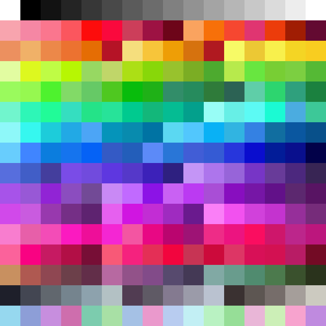
and there we have it! i definitely wouldn’t try to convince anyone that it’s suitable for everything, but i think it’s pretty close to exactly what i want for this little project. at least, close enough that i’m not gonna fuck with it anymore, hah. the goal was for it to be mostly cool colors and have a healthy bit of pastels, and for the sprites to end up feeling a bit … uhh … internet, for lack of a better term. anyway, it was a good learning experience making this thing