holy fuck me. its been three months. im a changed boi. (read: i had a major depressive spiral after releasing DB)
aaanyway. im back with one of these, and im not gonna lie im madly proud of this one! Basically all of the GUI work was done in October before i stopped doing, well, anything, and i think the design and first frame of the lil guy was also done around that time? and today and yesterday was just animating them and then assembling everything.
i am, as i slowly acclimate to life and work again, going to be probably slowing this down to one friend a month instead of every other week, because i feel like i can handle that right now. though lord knows i may end up doing more than that anyway when i feel up for it!
anyway. without further ado:
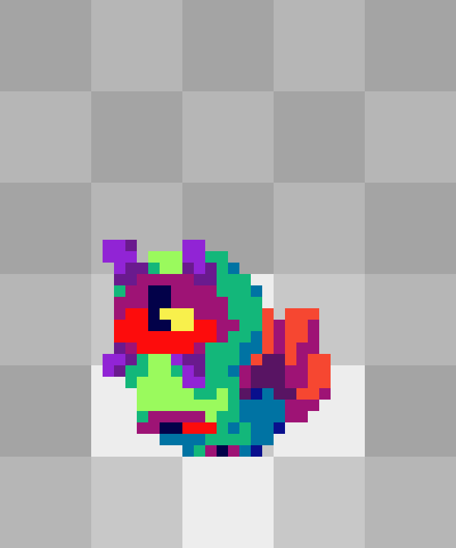
Friend six ONE(?): Tympole, Psychic/Grass : THOUGHTGRUB.frnd
So before the fun stuff I’m gonna explain to you what a row in my godforsaken spreadsheet is like here, because i’m not playing the ROM anymore so I’m not gonna bother grabbing screenshots. In order, we have:
- The original Pokemon in name and official art
- The file.frnd’s name and the first frame of their final sprite (blurred here so that we don’t spoil the journey)
- The type the Pokemon got and the Type that the file.frnd is (Cherub was an Angel)
- A role that describes the Pokemon’s random stat spread
- The ability of the Pokemon
- How I feel about the random elements
- The Pokemon’s evolution information and the compresion stage it is in file.frnds
- Some choice moves from the Pokemon and some ideas of moves for the file.frnd
- Whatever my initial thoughts were for the design
Did that need such a detailed run-down? Probably not. Moving on, in this case we also have what I did for this lil pal in the past:

Which I still like some elements of and want to keep - while I’m going to be doing a totally new "re"design (re in quotes because i never really took time to design the original in the first place honestly lol) I still want to be able to say “yeah thats the same lil guy but just re-imagined”. So what DO I want to keep? Well I like the big eye motif, it’s a good way to play off of Tympole’s shapes while also communicating weird/pschic. And frankly I like the green and magenta/red color scheme too.
Now the big idea going in here is the sporocyst of the green-banded broodsac (that’s e first life stage of the parasite that turns snails into “zombies” and gets them gobbled by birds), and lucky me that has a similar color situation. I’m not gonna link images here cuz some folks probably would find it pretty nasty to look at, but you have google
So here’s the first round of designs! Some consistent themes here are the tail, which has been reimagined into a weird leaf-thing from the sporocyst’s spore cluster, and then the biggest things i’m trying to figure out are body shape and what to do with the eyes. with the criminally small size i gave myself for these sprites, theres really only so many poses i can give a little noodle buddy. Anyway, I end up liking the two on the left the most and make them the major basis of the next generation, though i keep playing with the tendril-eyelashes of the others.
here i’ve also landed at a more consistent general idea for a palette. 3 saw me exploring more buggy features, and while i do actually quite like that weirdo, they don’t really work for what i’m going for here. especially considering another part of this design is trying to make this werido feel like a weird starter, which requires just slightly more anthropomorphization than that. speaking of which, 5 dialed cutesy elements (big eyes, bushy tail, chubby body) up to such grotesque degrees that it ends up being the most horrifying of the bunch. and 4 is just a bit weak - 1 and 2 end up being my keepers here. 2 looks like it is in constant pain, and 1 is a bit nondescript, but theyre the best of the bunch imo.
okay round 3. 1 is largely a cutsie-ization of our previous 1 and it still is kinda weak. 2 is definitely half-baked, and 4 still looks like theyre in pain (tho it was on purpose this time). 3 feels largely pretty good to me though. the purple patterning was an attempt to look like welling tears as a coat pattern but its kinda weak. but i like eye body, and i like squishy friend. though i do think they could use more body definition, and a slightly more defined head would be preferable. which leads us to …
the final design! segmented body to feel a bit more like a grub, the tail is slightly better defined, and overall it just feels more complete. here you can see i was experimenting with palettes, and well, you can also see pretty clearly which one won out lol. 1 and 3 are both pretty neat, 1 feels almost kinda mystical to me and 3 feels like, eldritch? iunno. but 4 is similar to the green-band, its similar to the og verison of this friend, and it just makes them feel the most like a simple, if weird, monster friend.
And then I sprited them, and i … super did not take any screenshots of that process. it was actually a relatively painless one.
I babied up their proportions a bit more with the head sizing, and I reduced the segments to work better at the small scale of these sprites.
animating them was also, honestly, pretty painless, despite the months-long hiatus from doing it! i worked up a sketch pretty quick by sketching in one other keyframe and then just doing my inbetweens:
i didn’t need to think too hard - them being a wiggly worm in the air just made the most sense. 8 frame loop, which is becoming so much the norm for these that i’m basically deciding to codify it as the length for all of these idles. anyway, then i went in and sketched in a blink and sketched in some shading:

naturally things got pushed around here and there between the two as well, notably the head hanging back a bit more when they come back down to give the wiggle slightly more snap (its barely there). the blink is two frames both times, and neither time does the eye ever fully close. (also there is a frame of lead-in to the blink, and then the blink, but there isnt any frames on the other end of it its just back to fully open). to me, i think this sells the blink pretty well, especially with how fast they happen in real. also they arent evenly spread, theres 1 frame between them one way and 3 the other, i just felt like it gives it more energy.
so then i cleaned it up the first time:

and there are just some minute things here that i feel like i have to change. and theyre the kinda thing that happen to me everytime i animate, so in the spirit of this thread being me trying to document how and why im doing things i’m going to get into it here:
decisions that make sense within a frame, but look bad in motion. i make these constantly, and after i get to this stage in like every animation, there’s always a number of them. in this case, we have:
- the little midtone pixel in the bottom left of their head. it serves to break up the shape and make the highlight feel smaller and define the head as they move. however, in motion, it feels like a weird tacked-on element that just muddies things.
- the shadow under the lower right antenna/eyelash. it ends up coinciding with some other shadows and as they animate, it almost looks like its forging a line of midtone down their head and body. but, on a frame-by-frame basis, it makes sense as shadow.
- the darkest tone that is used as sparse pixels near their butt zone. it’s important to add tiny bits of definition back there, shaping certain edges and curves, and can also try to help keep definition of their segmented body. However, here, there’s a lot of them that end up flashing like weird floating pixels because, while they made sense in a frame and made it look better individually, end up too far removed from their positions in previous frames.
each of these, when the animation is playing, haunt me, stick out to me like sore thumbs, even if all of them would have made their individual frames look ‘better’ standalone. what i need is for them to look good in motion though, so lets fix those. oh also lets add highlights to the middle eye when its fully visible:

Great! that’s them. so lets once again go back in time to the work i did on our new GUI - the pause menu, the party window, and the window for looking at one .frnd in specific.

So I decided to give the background animation this time because … i like pain, probably. but this one is bad so lets make that motion less janky:

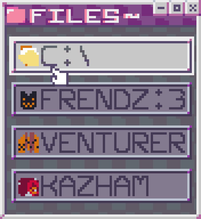
Much better! also yes the pause menu is just our file browser

Anyway now things get exciting! I’ve added in another animated background, and our different programs, folders, and drives here bounce! isn’t that nice. We’ve got our root directory for C which is our inventory, we’ve got our folder with our .frnds in it, we’ve got our web browser (i dont remember what fake mechanics ive come up with for that, but they exist. also obviously its a parody of explorer and i guess safari why do they both have similar names), and we have our torrenting program (obviously its a play on kazaa, and kazham was funnier than kazam. thanks sarah once again, though my idea was ‘lemon plug’ and i still think thats kinda funny. the torrenting program has a lot of overly complicated fake mechanics that i’m very excited to explore the ramifications of … in that fake strategy guide if i ever make it in XX years)
the buttons linger in the middle spot so that theres some security as to where their ‘real’ location is.

and here’s some icons for them! isn’t that nice. the venturer one is SUPOSED to be a trifold map with an x marks the spot and little trail, it will be getting redone in future updates we make here.
anyway lets get a cursor going:

bam! so now only the selected one animates, we have our tapping mouse cursor, we have the flashing white border when the mouse taps, and the non-selected ones darken and lose their highlight tones. you may also notice a VERY subtle gradient on the text of the currently selected option. i just thought it looked nicer than a flat color and helped it pop subtly compared to the shadowed palette, thats all
also venturer is going to get redesigned again so dont get attached to that map

you won’t really get to see it later tho so here it is for you, as a treat. (except actually you will in snippets because i accidentally left it in in a few frames and that mistake is in the final and im not fucking fixing it) now lets get back to business and get into our frendz menu
so a LOT to talk about here! and before we get any further i wanna talk about one big thing that has been driving my thoughts with things like clicks or even the idle cursor tapping with this project - this isn’t a real video game and there is no sound. just gifs! which means we are lacking in one of the kinds of feedback that games send to players. this is like watching someone type on a typewriter and not hearing the keys click. it’s unsatisfying!
to account for this, i’ve been trying to make things look tactile - to have dramatic squishes or to make a button look like its depressing when its clicked. because i want these to, despite the fact that there are no inputs and no sound, to still feel like something is happening. to look at the Frendz button as an example, when it clicks, we have the mouse cursor going to its click frame and holding for a frame before the fade starts - that little frozen time effect helps give the moment of the click more emphasis. Also, when its clicked not only does the button go into its darkened, but the lil botamon lookin dude goes into their squish frame, AND, the lil dude and the text all drop down by one pixel within the button - it helps give the illusion that theyre pressing into it from the force of the click.
i think for the most part my attempts at this are successful? i feel pretty good about the tactile-ness of the menus. anyway.
the buttons fade, starting from the top one and ending with the bottom, but they fade from their bottoms to their tops. helps give the fade a sorta like, wave/screenwipe feeling. i like it! the fade is an interesting little dither effect where i think around 4-6 rows of pixels are given a transparent dither each frame, and each frame about 2-4 of those are totally erased, but then at the end it erases all but a few, which then each space out by a row and move upward. basically the idea is it feels like they disentegrate and then are wiped away / blow away. whether or not that comes across, i like the way it feels.
then we’ve got the frendz menu itself! once again, we’ve got shadowed palettes for options that arent selected, and we’ve got staggered floating for each. (i didnt mention it before but obviously the floating of the buttons in the first screen of the GUI are also staggered, in both cases here theyre staggered by 1 frame each with the topmost acting first and the rest following suit in order). and then we’ve got places for each .frnd’s portrait, their health, and their mood. what does any of that mean? who knows!
you’ll notice that the ones with missing health are kinda like, spilling over as though the health is a sorta viscous fluid? at least thats the idea. it gets animated later but i hadnt done it yet at this point. it comes across better when its animated

okay so what have we added? well first of all we’ve got our cursor on the frendz screen and we can click on a .frnd now! when it does, you’ll notice that the portrait box squishes, and the little mood face also opens up. more of that attempt at looking tactile.
more significantly we now have our window for viewing a .frnd! overall i’m pretty happy with it, and the space i had dictated the decision that each of these lil guys know two moves cuz thats what looked nice here. their name will fill in in the top bar, and then theres the .frnd extension baked into the visual. i will say that i end up changing the coloration up there to something much simpler, that weird dithering wasnt working for me.
what i DO like is my little display platform and its dithered abstract space. i like the energy and i think the colors strike a good balance between abstract net space and generic sky while also not being anything thatll clash too much against any particular .frnd
i decided that ‘type’ here is going to get to be a 5-letter abbreviation, rather than the larger icons for them (which you can see an example of in the angel from Cherub) uhhh cuz i thought centering the titles looked nicer here, no other reason.
also lets quick talk about this windows opening! it takes 4 frames to get to full size, and originates from the general area of the .frnd which was clicked. nothing too crazy, just a series of increasingly larger genericized versions of the window which have just enough of the colors and details to look alright as it opening. also its got a little bit of sideways motion, helps feel like it pops forward i think
okay so its all ready to be put together, so lets establish what’s gonna change:
- the top bar of the .frnd screen gets cleaned up
- an inbetween is added to the portrait squish when a .frnd is clicked
- added a one-frame darkening of the ‘x’ in the .frnd window for it closing, and used two of its 3 opening inbetweens as a close animation to make this thing loop.
- deselected .frnd portraits are only their darkest colors, and some have new bg colors to look a little better with this change
- the missing health gets animated, red animates slower than orange/yellow. also they splash a little.
- the portrait for the selected friend does its two talk keyframes while being tapped, and then has squish frames for the click
anyway without further ado:

i am … super proud of this thing. this is one of the best things ive ever done, i feel like. there’s a lot of parts going on, it was a lot of work, and i think it has a great energy. im especially proud of the GUI work, it was an interesting challenge to make these menus as nothing but art mockups of a game that’ll never exist
anyway. that’s thoughtgrub! the next .frnd is going to be yet another weird little freak, and then i get to start patching/upgrading/whatever i decide to call evolving this first party! which will of course mean needing to figure out more windows and animations but i’m kinda excited about it, a little.
love all of you sick freaks who read this fucking essay of a post
and the ones who didnt too
i wont judge sbutts too hard


