What are the best “old-school” style pixel GUIs, both from games and actual applications?
Really early 1-bit GUIs have their charm, but my favorite are late 80s - early90s 16 bit-ish GUIs
I dig the UI in Syndicate. Gotta love those 1-pixel bevels and highlight colors with a limited palette. The isometric viewport also helps, but let’s focus on the GUI
A lot of the Amiga/Atari/Mac System 6 to 8 aesthetic is great. Deluxe Paint would be another candidate I guess.
PC/Windows always sucked for pretty UIs
While I don’t have any first hand experience with them, the screenshots I found on the web seem to indicate the PC98 is rife with this kind of stuff. I mean, look at that:
both from Power Dolls
Typically, sim games, strategy games and other naturally UI-heavy genres make for better examples of this.
A-train IV
What are the best examples of this style that you know?
While obviously more “flavored” for the game than my previous screens, a modern example os this is Bastard Bonds. I love how this game looks in general, and the UI is no exception. I normally hate when a pixel game mixes resolutions, but it works here because the animation is mostly sprite scaling and rotation. Think PSX Symphony of the Night look & feel.
I always loved the interface of Hiouden and sequel on PC-98, it’s a lite-RTSRPG from Wolf Team where the main concern is making sure your little dudes are mindlessly swarming enemies at the right angles and intervals, but you also have to position different squads to solve basic lock/key obstacles or grab items. To facilitate this, the interface is actually five windows you can move, resize or close:
(screens taken from Mobygames)
It was a 1992 release that was designed around mouse support, which doesn’t sound terribly weird to us Westerners but was actually quite rare for Japanese PC games of that era. The window in the lower right corner of the first screen is actually for system options like save/load/options.
What I suppose is actually remarkable is that the first game was remade for SNES, and it actually retains both mouse support and a limited form of the window options! AGTP translated it if you’re curious enough to try wrestling with it sometime. I’ll try and edit in some pics of it later.
Just want ed to say that I love this thread. Looking forward to going through screenshots to pull out some examples later! I don’t think I have anything as great as all this Japanese PC stuff though.
Thanks! I am mainly focusing on games now, because Selectbutton, but I guess app software is fair game too!
One example I wanted to talk about is the look of BeOS (and to a lesser extent, Haiku, because being modern, it had to replace pixels with vector based icons…)
Always liked the grey with yellow accents scheme. Feels different. The tab-like windows are cool, too.
my especial interest is guis that are ‘functionally’ old-desktop in style but have a bit of game-relevant flavour ie.
golem master
brandish vt
posessioner
hell yea
suzaku
pc98 and other japanese desktops of the era are interesting because the popular desktop-ui paradigm is young enough to be functional/minimal, color limitations are low, and resolutions are uncharacteristically high.
this kind of interface starts to disappear in 92 and is pretty much gone by 94.
there’s arguably a sort-of revival in ui-heavy s/rpg handheld console games from the 00’s (primarily GBA), where resolution is uncharacteristically small but the ui paradigm is modern (semi-transparent windows, onscreen button prompts etc), so there’s some deference to older ui styles that work at lower resolution.
generally desktop uis shortly after 2000 stop looking like this since higher resolutions led to antialiased type, OSX’s toothpaste looking Aqua, XP’s primary coloured Fisher-Price-plastic Luna. as a kid i had long wished everyday pc interfaces were as compelling to me as videogame menus were… and shortly after regretted it. although uh, there’s plenty not to miss, too.
to my eye, in the era of post flat-design blight where interface is basically erased altogether amid big fields of colour, oversized typography, vague shapeless icons, where everything looks like boring 1950s swiss print design, this kind of interface still looks great. hoping that these little bits of bevel detail make a comeback soon against google’s loathsome mobile-everywhere material design bullshit.
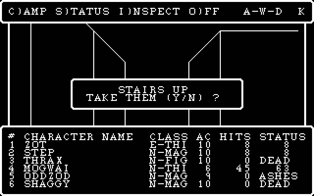
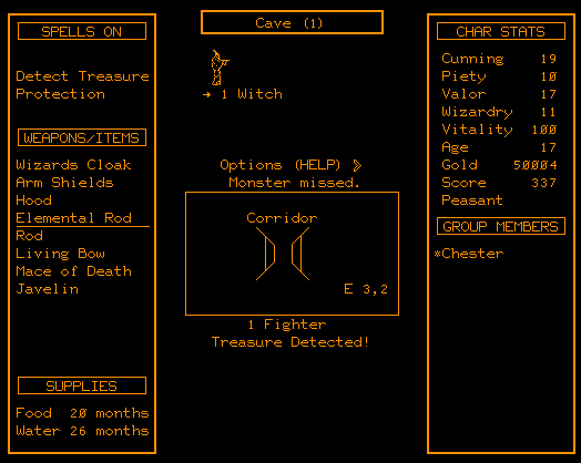
the canonised jrpg menu interface is descended from wizardry, is descended from moria. in general jrpgs owe a lot of their interface to early apple ui (“window wizardry” being a lisa-style gui retconned into wizardry 1 and 2, square’s early use of kare’s Chicago, etc).
here’s a lovely interview with the original designer of the ‘final fantasy finger’. as far as natural evolution of the classic window/menu design goes i find ff9 extremely pleasing, soft-antialiasing and all.
wow uhh. i guess i’ve been wanting to put this down somewhere for a while, sorry for the tangent-chasing ramble in yr thread iacus, heh
As someone who really, really likes boring swiss print design, I have to say Google diverges a bit too much in their Material Design, what with the long shadows crap and insistence on (too many) pastel colors everywhere. Flat UI is ok as long as it’s pure enough.
By all means! I didn’t comment on it before, but I hate both playing and looking at games that spawn a ton of separate windows on the desktop. Is cumbersome and ugly. Give me everything integrated in a dedicated viewport, please.


