Iridion 3D
I am a big fan of the “3D” shooters like Starfox and Tetrastar. This was an early GBA game I was obsessed with. It uses prerendered animations for the background scrolling, and it runs at 60fps, so it looks incredible even though it’s repetitive.
Unfortunately the powerups suck, the ship graphic covers where your shots go, so it’s really hard to aim down the playfield. The first boss is just stupid difficult. It also uses ye-old password system to save progress. You are just holding the A button down the whole time too. There aren’t any alternate weapons like bombs and there’s no way to dodge. I feel like with a little more design it would have been better imo
Driv3r
I am pretty sure this is made by the same cats who did the Stuntman port for the GBA. It’s technically a 3rd person driving and shooting game. You can get into and out of cars, drive them around, get out of the car, and shoot people with a gun. From what I can tell the entire map from the PS2 game is recreated in the GBA’s game engine. The texture and polygon warping when you get close to surfaces is very severe.
This is a category of game that is technically impressive but just not good enough to stand on it’s own. It’s trying to do too much. It mostly, technically, succeeds at it. But like, it isn’t “fun”.
Karnaaj Rally
This is a game mainly known for having terrible box art. Seanbaby used to have a feature in EGM where, at the end of the issue, he’d tear into a bunch of terrible games and call them shitty. It was kind of funny to read at the time. One of those games was Karnaaj Rally which he refused to actually play or review, and then in the next month’s issue he did review it because the publisher called the magazine to complain. and said it was terrible.
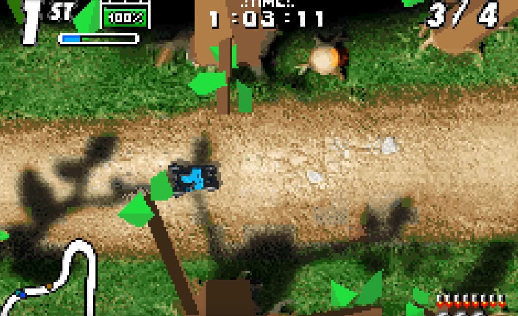
Well actually it’s not bad, in fact I’d say it’s probably the best top down racer for the GBA that I’ve played. It’s clearly done by a bunch of Polish demoscene guys because the music sounds like a demoscene thing, and it does a bunch of demoscene tricks…IDK how to qualify that it’s just what it looks like.
So yeah the game uses a combination of high resolution ground textures, 3D polygonal art, and a fore and background 2d plane, to create a really really good sense of depth. They went as far as to bake the shadows in for the 3D polygonal objects like trees and rocks. The racing mechanics are pretty well realized, you have to manage your boost and weapons throughout a race and that gets pretty interesting. In between races you upgrade parts of the car. The game’s career mode starts you in the BC era with a bunch of stone age flintsones knockoff cars and the tracks are all dinosaur themed. Then you go to the modern era and drive a bunch of old-timey cars. Presumably you get race cars in later levels.
All in all it’s actually a really interesting game malaigned by bad cover art and a terrible reviewer. It has a kind of anti-style that you only get from early 00’s eurojank software houses. In between races you talk to your racing “sponsor” who has a weird mug, and you get to choose what weird mug that represents you. These are probably the developers


![Longplay: Death Rally (1996) [MS-DOS]](https://dlcn7yodlhcnn.cloudfront.net/original/4X/e/0/d/e0d092daf3918f79715cfde8dc529ca867ba7f7e.jpeg)