the behaviour we have is correct, right now it’s using the mobile timeline element on desktop effectively, and it’s just a new positioning bug
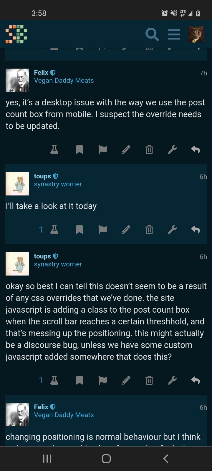
so we want it to snap just beneath the header on desktop and mobile as well?
I don’t believe we’ve overridden the mobile behaviour at all and I don’t want to change that any further
The mobile behavior is to snap below the bottom post but I don’t know how to accomplish that on desktop.
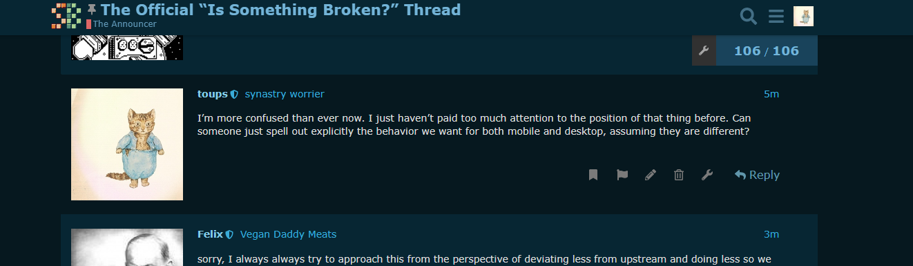
I’m more confused than ever now. I just haven’t paid too much attention to the position of that thing before. Can someone just spell out explicitly the behavior we want for both mobile and desktop, assuming they are different?
sorry, I always always try to approach this from the perspective of deviating less from upstream and doing less so we don’t wind up with unmaintainable overrides, and I think that tends to inflect the way I talk about this.
I do not remember how the box behaved on desktop prior to this upstream breakage, the mobile behaviour is stock, the intent was always for the desktop behaviour to follow the stock mobile behaviour
It appears the intended stock behavior would be for it to stick the to header like this:
If we have an override that attempts to make it stick to the bottom I do not see any of that css being applied. It just seems that for whatever reason the css variable
--header-offset is off by a few dozen pixels. I can’t imagine we have code that is messing with how those offsets are calculated, especially because I imagine you’d want to use bottom rule instead of top for having it replicate on mobile.
The straightest path through the mud here is to just add new custom extension to create that behavior from scratch, but if anyone has an inkling as to which extension supposedly is already trying to do that, I’d rather start there for sanity’s sake. But I can’t find anything like that so far.
I think this may have been a botagel original if @villain has no insight here, just want to double check with them before you go to town
thank you both!!
1 Like
yeah I just went over them all with a fine tooth comb and I can’t find anything touching the topic navigator widget. just gonna roll my sleeves up and fist it to where it belongs 
the more I investigate this it seems it would involve considerable dom manipulation to recreate the mobile behavior on desktop. is that why I can’t find the mod that is supposedly doing it? I don’t think it’d be possible with pure css.
okay I found a shitty flexbox workaround. it could possibly have undesirable side effects so please ping me if y’all notice anything else broken after I set this up lol
1 Like
And it’s implemented. I’ll take my reddit gold now 
12 Likes
fantastic, thank you!!
make sure you refresh the site (close and reopen a new tab if you gotta) after the fix is in. everything is working 100% as intended for me now on both desktop chrome and iOS, can’t test android
1 Like
I set it up to be desktop only, since I thought it wasn’t an issue on mobile. It’s simple enough to apply to both, although I’d be a little more worried about layout bugs on mobile browsers, especially because ios safari’s flexbox implementation is somehow still not fully up to spec.
I wonder if discourse’s breakpoints are interpreting your phone as desktop. Even if that’s the case it seems like it should still render correctly. I’m assuming you’re using android chrome?
1 Like
Felix got it—I needed to refresh, and normal function has returned.
2 Likes

that’s me, I’m a pervert
4 Likes