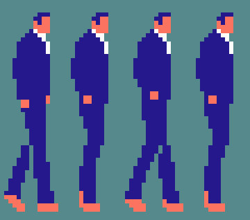
i feel like those couple pixels of hair visible under the arm can be a little confusing but otherwise it strikes me as perfectly legible. what’s the issue, is it the values of the different colours being kind of close together?
1 Like
it’s mostly the arms that i’m worried about; making sure that you can clearly see that they are arms and that the left arm isn’t just jutting out of the stomach.
some spritework i’ve been looking at as an influence (and what will finally confirm that i am a select button poster) is golgo 13 on nes. i’ve always liked how you can clearly tell where duke togo’s arms and legs are, even though his entire body is one solid color. my challenge to myself is to make these semi-realistic characters with the famicom’s limitations, and make sure that it all doesn’t look like a big blob of color.
19 Likes
oh your arms are drawn just fine! clearer than that golgo13 example if anything. i like the frilly cuffs. i think the issue with the sleeveless one is specifically that the hair colour and skin colour are very close in brightness (i can’t tell them apart at all if i look at it in greyscale) which makes the back arm a little less distinct. i suppose that also makes the face less distinct since you don’t have the darker-purple eyes as an anchor with these proportions. i imagine this particular palette is pretty dear to you though
2 Likes
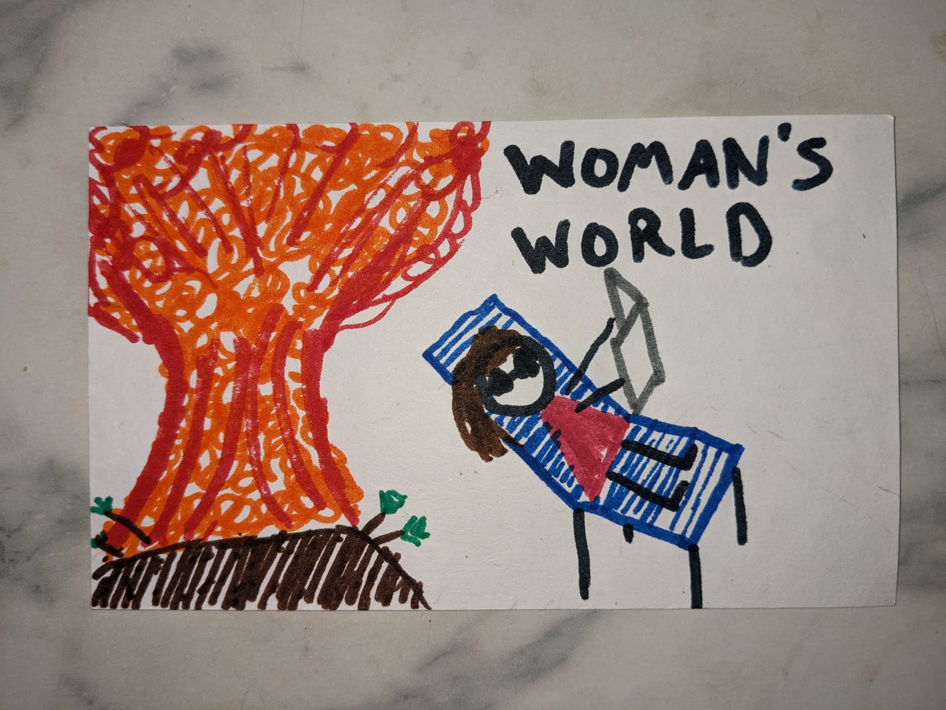
my mom usually asks for a “woman’s world” magazine for xmas which does not have a physical component i can wrap so i make pictures instead

need someone other than my mother to appreciate my art
32 Likes
one time i gave my mom a painting and she put it in a bathroom that no one used
18 Likes
I gave my mom a few photos, some are in the bathroom, one was in the kitchen and then swapped out and left at the bottom of a pile of stuff so I took that one back and hung it in my own house and I don’t think it ever dawned on her
7 Likes

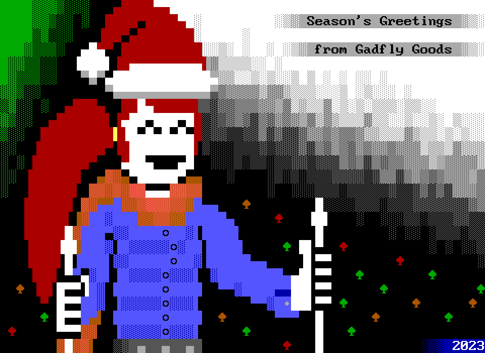
made this year’s xmas card. I think I outdid myself with how minimalist it looks. picking up the printz tomorrow, I might have enough envelopes for everyone
31 Likes
this gives warm feelings to look at
3 Likes
oh my god this fucken rules
3 Likes

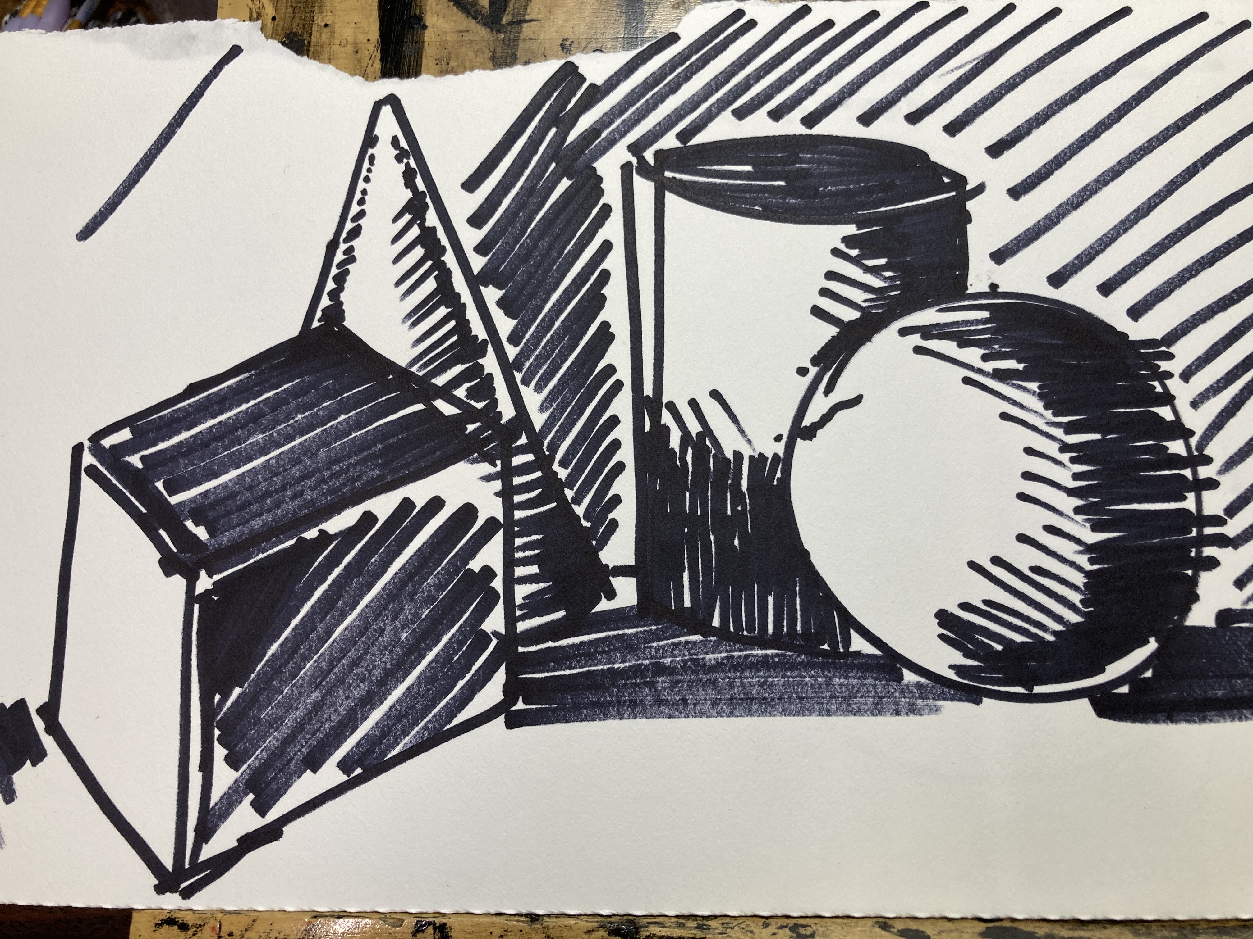
just exercises but still striking
1 Like

thought about picking up that game idea i was working on not too long ago. changed the protagonist sprite to look better and made things less claustrophobic.
then
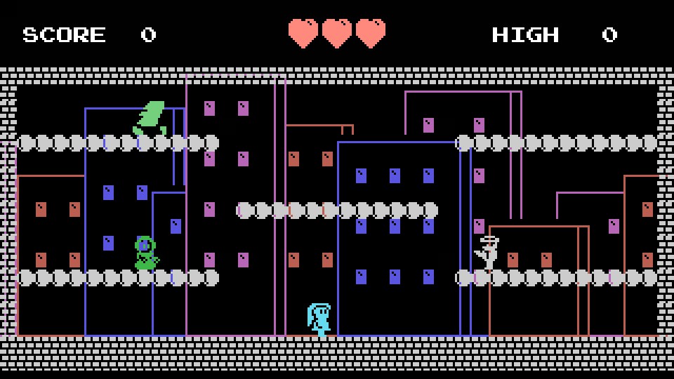
now
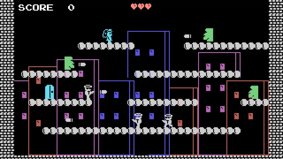
27 Likes
beautiful!
1 Like

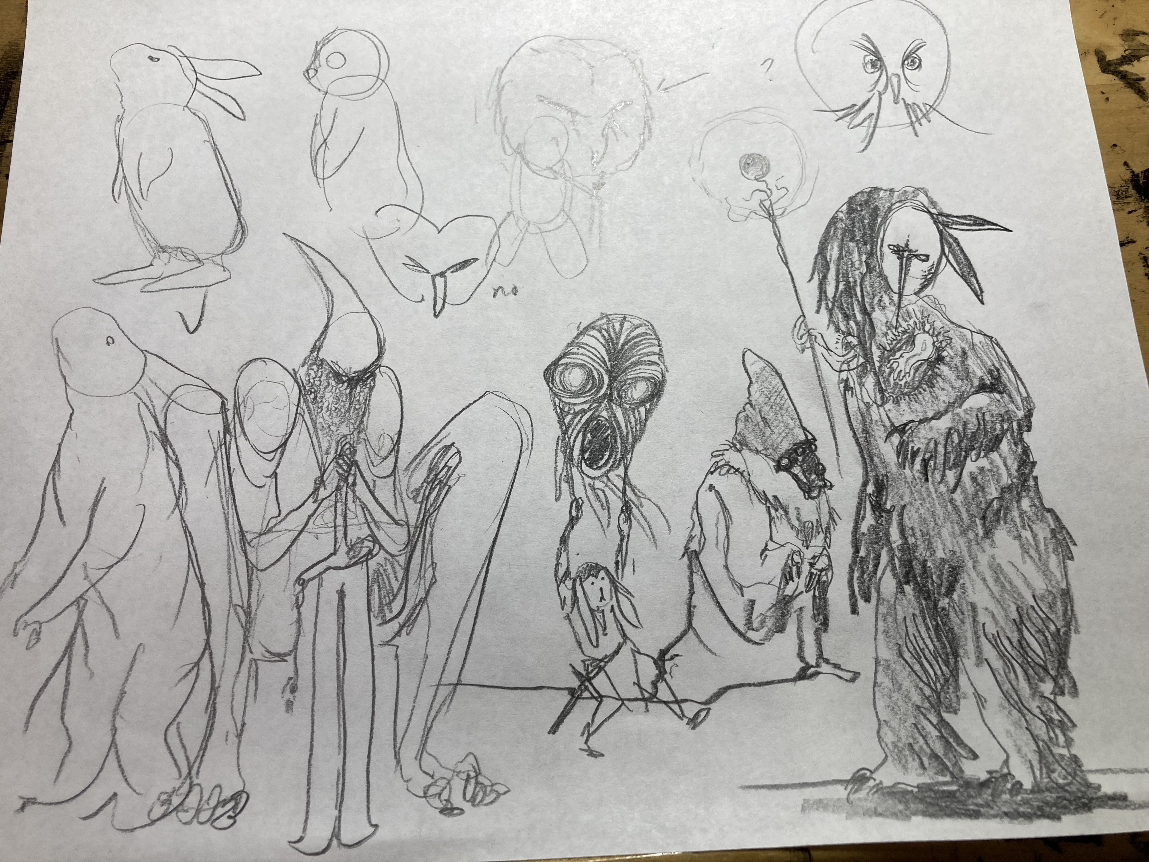
more shape studies and some Wizords. also some kind of little bunny guy. think there might be more bunny guys forthcoming
26 Likes
YEAH BUNNY GUYS TO JOIN BIRDHEAD
1 Like
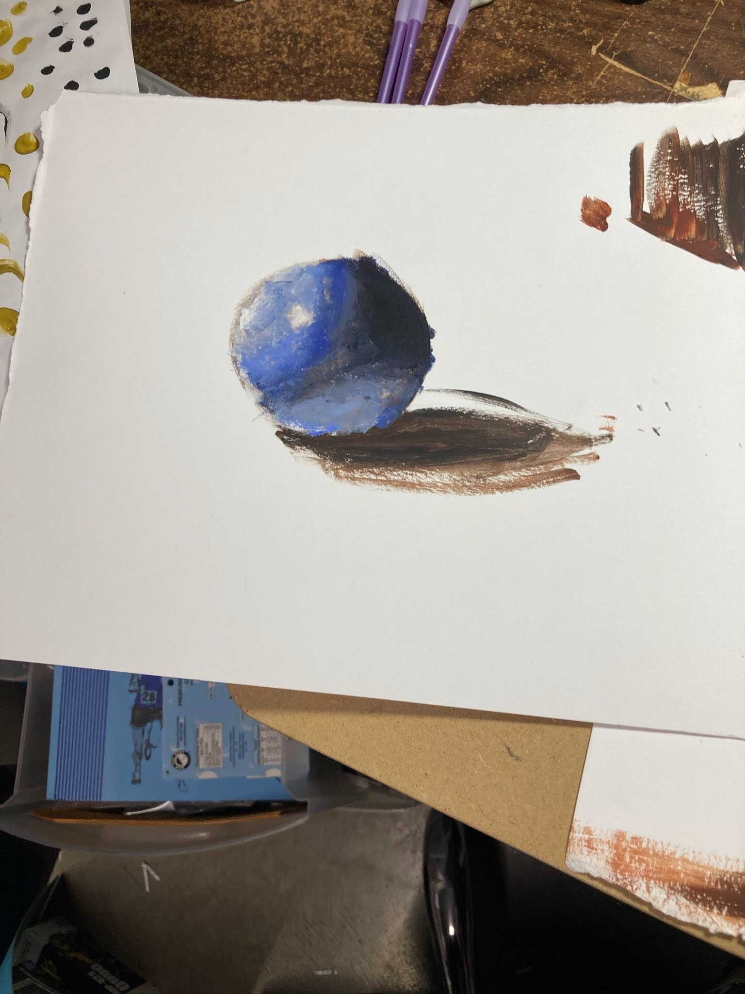
I thought that ball was an actual ball of clay-like paint or something. = oo Very convincing shading!! ^_ ^
1 Like
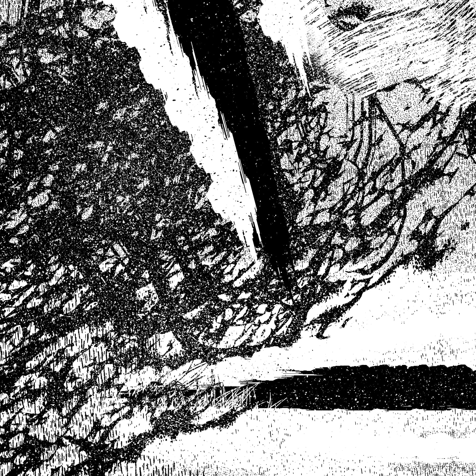
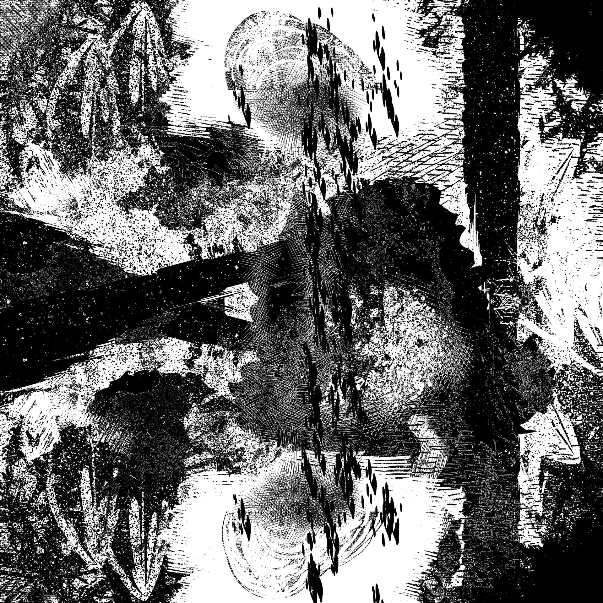
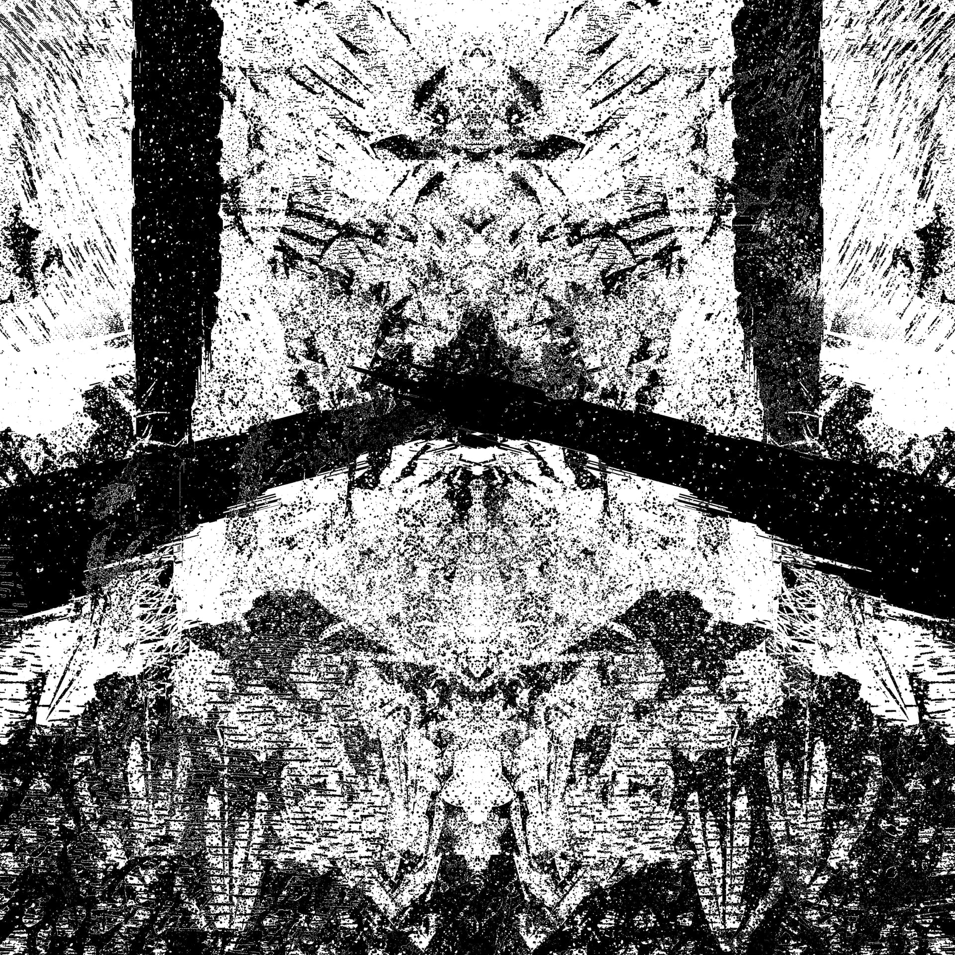
OK here are some of the pieces I did as interiors, some of them were for zines, some of them were just for me, please admire them, it’s worth clicking ‘view original size’ so you can see all the details in my opinion, I couldn’t link these from my website cuz that site is kinda broke, thank you


41 Likes
these are so cool
5 Likes