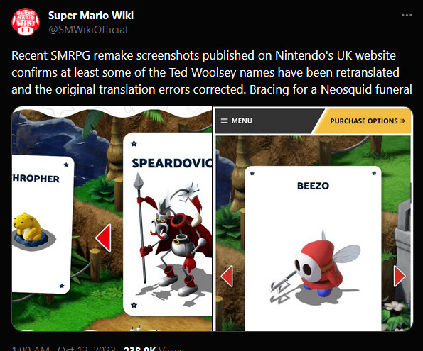
This is a thread for @daphaknee to post grievances about the Mario RPG remake, because I want to read them!
maybe I’ll love it maybe it’ll prove me wrong ![]()
here ill move my first bad impression. i promise im trying as hard as i can to like this game though. ive played the snes one like 20 fuckijng times!
is there a new mario rpg thread? is there a support group? im already upset i already cant take this
oh wow what a downgrade
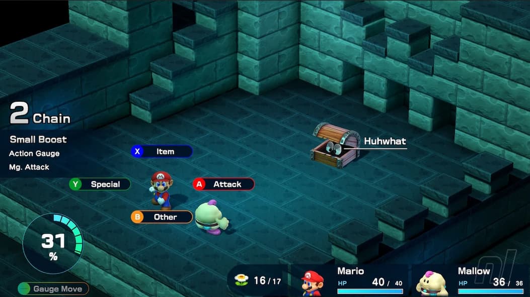
wtf building that trash ui has to be so much more work than just upscaling the graphics on the old one. did they graft web views into the engine so that they could create perfectly generic visuals. did they add extra text labels to everything out of sheer disrespect for their users or because they were following accessibility guidelines? are people playing mario rpg on screen readers
well, maybe other people have nostalgia for dialogs with semi-transparent backgrounds and helvetica everywhere
I just realized this game isn’t even out yet lol. November 17th. I just assumed Daphny was already playing it!
ive been actually surprised at how pretty & close to the original this looks so that UI is a really jarring choice to see yikes
Cmon just remake the cute parallax scrolling flowers in HD its a fucking mario game
Why change LEVEL UP BONUS from that amazing chunky Mario font & clown vomit colors

left screen vibes
whereas right screen vibes
… ![]()
clearly putting my chips on the left side, thank you very much!
im breathing into a paper bag
i keep pulling these from articles that say MARIO RPG IS 100 PERCENT FAITHFUL TO THE ORIGINAL. what made people stop caring about UI
i cant stomach this. how am i supposed to play this
10 days until i rage
im gonna have to stream this shit im already dreading it
Wow, that monkey thought bubble is egregious. Talk about killing the vibe. It looks like an infographic from a z-grade 2014 web user experience textbook.
also the gauge and the fucking chain and all the busy bullshit they added on for no reason
they couldnt deal with how fucking clean and simple and color coded to your controllers buttons the old one was (getting rid of the color coding makes sense since everyone isnt playign it on the same controller anymore but i dont give a shit about having a 2 combo up at all fucking times)
where is the fun in the fonts
video / game motherfucker
Nintendo’s recent tendency for ‘clean’ UI has really gone too far
yeah like me when i dont sleep and i feel dirty and i start scrubbing the skin off my arms and legs
Watching those screencaps, i feel
Ah! That’s what I need. That’s much easier to work with.
Even stranger when the thousand year door remaster looks mostly fine.
The font


![Central Cee x Dave - Sprinter [Music Video]](https://dlcn7yodlhcnn.cloudfront.net/original/4X/5/2/e/52e03056ac9f2671b0a1827467f62670985c5181.jpeg)


