I love my eMac but holy shit is it loud. Awesome photos.
Transfered my PC from the trashy early-2k-era mid-tower where it previously resided into a small metal cabinet. Double-sided tape + drill/hole-saw. Tidied up cabling. Reorganized gaming nook. Re-styled AdvanceMENU setup.


18 Likes
oh i forgot about this thread. Saw a tweet last night that would be 100% relevant to it, featuring Werdna from Wizardry.

top to bottom, left to right:
- crt + rf
- crt + composite
- plasma + rf
- plasma + composite
- plasma + hdmi
12 Likes
Oh my god this is beautiful
1 Like
See individual pixels in action. They’re actually rectangular! And on CRT screens they have two rounded edges and two sharp edges?!
7 Likes
it’s kind of a misnomer to call them pixels to begin with because CRTs are analog and measure their output in lines of resolution (or, if you want to get fancy, TVL) and assigning them a fixed resolution in pixels which is a digital thing is madness and furthermore
9 Likes
Point is, pixels don’t have a shape; they’re an abstract concept; just theoretical points, which (in original use) are intended to display in a messy, overlapping way. It’s like a mind/brain thing.
But yeah. Cool stuff!
3 Likes
Damn, how did I forget about Victor’s setup
Ah no, sorry fellas, they’re rectangles. I saw it online so it’s obviously true.
1 Like
This is a cool vid.

That’s the way to do it.
So much of the blame for this goes back to NES game box art. Not for my beloved (albeit mystifying) Adventures of Lolo, but many of the first-party Nintendo games used pixel pictographs with motion blur: Mario. Metroid. Duck Hunt. Excitebike. It shouldn’t surprise me how many of these boxes had different art when they were released for the Famicom, and yet.
3 Likes
That’s an interesting point. And it makes me wonder how sprite concepts drawn on grid paper handled this.
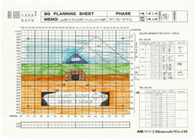
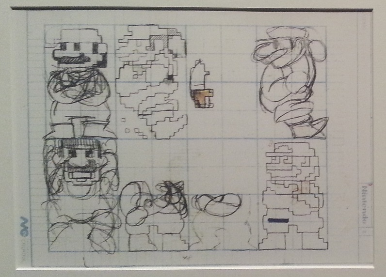
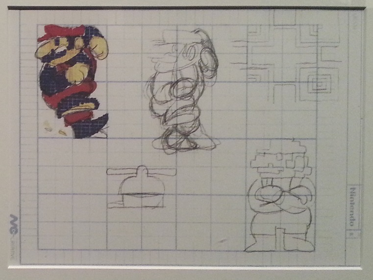
It’s pretty hard to tell, but measuring the light gridlines visible in the colored grids gives me something like a 4:3 aspect ratio on the grid. Neat!
3 Likes
It seems to have been a common practice. I’ve seen some unsourced images like these floating around at least claiming to be from Akiman where he explains how they used custom graph paper like this with squashed squares that fit the odd 12:7 ratio that CPS-2 outputted at.


5 Likes
They’re from his own twitter, yes.
Camera Phone + 4k TV + OSSC.
Mega Drive : 240p -> RGB Scart
*Disney’s Aladin

*Super Street Fighter II

*World of Illusion

*Columns

PS2 : 480i -> Scart outputing… components Oo ?!
Shinobi


Auto Modelista

Way of the Samurai

PS2 : 240p -> RGB Scart
*Megaman X Collection


*Panzer Dragoon


[EDIT] Arg, still does download the pictures from a share link on google… erm…
Ok, I’ll try bring them into the forum for full screen… if it is ok[/EDIT]
[EDIT2]
And some extra:
XBOX : 480pp -> Component
*Ninja Gaiden Black


6 Likes
Incredible article that partially touches on this
Some graphic designers toyed with these specificities and mastered the 0.5 dot technique. The word “pixel” translates in Japanese to “ドット” (”dot”). It seems that Hiroshi Ono (AKA Mr Dotman) was the first to use that word to describe his work, talking about dot-e (ドット絵, the “e” is the same as in “Ukiyo-e” and means picture) and dot character (ドットキャラクター or ドットキャラ) in the February 1983 issue of Namco NG.
“ It’s a technique where by slightly changing the color of surrounding pixels, to the human eye it looks like the pixels move by around 0.5 pixels. ” explains Kazuhiro Tanaka, graphic designer on Metal Slug (1996). His colleague Yasuyuki Oda adds that “ Back in the old days, we’d say [to our artists] "add 0.5 of a pixel”, and have them draw in the pixels by taking scanlines into account. But with the modern Full HD monitor, the pixels comes out too clearly and too perfectly that you can’t have that same taste. “
Ayano Koshiro (Streets of Rage 2), Eiji Koyama (Galaxy Fight), Yoshinori Yamamoto (Marvel Vs Capcom) as well as some people who worked with Nobuyuki Kuroki at SNK said that they used this half pixel technique back in the day. Tatsuro Iwamoto, graphic designer on the first episodes of the Phoenix Wright / Gyakuten Saiban series released on Game Boy Advance, explained that he took account of that (sometimes unwanted) effect on Nintendo’s portable console.
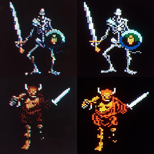
The Famicom version Wizardry (1987), a famous example to illustrate the differences in rendering between an old CRT ( scanlines, blur, colors) and an HD monitor from nowadays. These sprites have been created on and with a certain kind of screen in mind
30 Likes
Oh, this is marvelous.
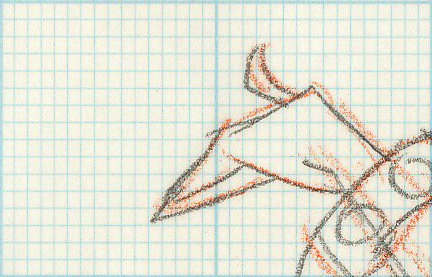
And a super-clear example of the non-square grid paper I was asking about upthread:
In order not to stretch their drawings, some graphic designers used custom grid paper with the same ratio as the pixels displayed by this or that machine. Tose, a company specialized in developing games for other entreprises, resorted to this technique on Famicom, as did Capcom with its arcade games and Hiroshi Makabe (Seiken Densetsu 1 and 2) when he worked on MSX.
5 Likes