This shit makes me want to scream so I’m writing an article for a Boston-based site on why


If this is happening in your city too please let me know
This shit makes me want to scream so I’m writing an article for a Boston-based site on why
If this is happening in your city too please let me know
I can see that these buildings are ugly collages of other buildings, but I would love some MS Paint arrows and text overlayed on at least one to show us what you’re experiencing when you look at them (please use the spraypaint tool)
mmm, wafers
Johnson rapped on colleague Borgins’ door with his unapologetically mountainous knuckles. When there was no response he opened it to find Borgins hunched over his desk, grasped cock out, like an illegal Quasimodo. Despite the intrusion, Borgins proceeded to ejaculate over a duplicate of Mies van der Rohe’s 1922 drawing of a skyscraper.
“The… economy! The linearity! The… the purity!” Borgins dribbled out, and came a second time. A gloppy film of manonnaise now covered the drawing.
Johnson leaned against a wall and lit a cigarette. “You’ve got to stop doing that.” His slit-mouth puffed out a cloud of sin. “Sooner or later, this room will start to smell.”
“You know what Mies does to me,” Borgins riposted, and sat back into his Herman Miller Eames executive work chair while returning his cock to the warm cave of his pants and zipping them up.
There’s a building in Olympia called “The Mistake by the Lake” that looks kind of like this. It’s a squat, ugly office building that has been unoccupied since the 70s and completely ruins the skyline of the town.
see if you can spot it.
dc suburbs have these big “luxury condos” in a color palette thats basically warm/cool/neutral in a very specific way
light blue/green + muted brick or faux-brick + metal or neutral stone color

(at least this one is strange)

I can’t tell what the supposed awful trend is here because these just look like the kind of crap they’ve been building around Orlando for years now. Maybe slightly more “ornate.”
My architecture vocabulary is too small to describe it accurately, but I would kill for Los Angeles to get some OK architecture, rather than just plain bad.
Yeah DC is rife with this shit.
Baltimore thankfully mostly isn’t, but there’s this hideous ziggurat thing that dominates one whole end of the Inner Harbor and kills the skyline from the ground (luckily it’s not tall enough to kill it from a distance):
Wide shot of the harbor, building on right:
Not exactly the glass boxes you hate. Actually ugly as shit instead of blankly mediocre. But I just want to bitch about it.
Second-worst building in Baltimore is the massive flat featureless Hilton that blocks half the sightline from the otherwise unimpeachably lovely Camden Yards:
STAY AT HILTON BLARGG
OK I can’t describe it but this confusing monstrosity now exists at the closest major intersection to my LA apt and it kills me
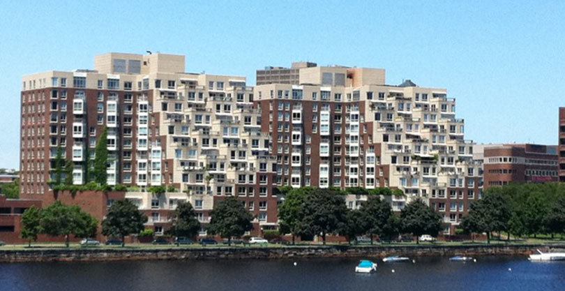
It’s not that new. In Boston it’s been happening since at least the mid-2000s. The issue is magnified here since for the past few years Boston has been experiencing one of the biggest booms in construction in the city’s history, and the city has a bottomlined goal for development that has little basis in reality.
Many of these are luxury condos, yeah. Either that or office buildings.
I don’t particularly mind the building in the fourth image you linked, at least in photographic form; there’s an actual sense of someone having put some thought into the structure’s visual appeal beyond just recessing or extruding parts of the facade or deciding which section should be cream-colored or brown. The bar is set very low here, though. The last image in your post seems typical of new residential buildings all over America. I think that’s part of why the aesthetic is angering: it’s rarely a response to the particularities of the site’s history. Non-local firms are contacted by a developer who wants to maximize profit, so the cost of construction is cut, leading to buildings that feel generalized and don’t offer much visual playfulness and almost never have any sort of notable ornamentation.
This is nice.
It looks worse in person, the rest of Trinity is pretty boring and bland nice, except for some dubious façades.
These and the bunch-of-intersecting-boxes are still the fashion in cheap buildings here too.
The fashion in slightly less cheap building is coloured mirrored glass, which I don’t mind so much.
Except when they’re green or purple. This green haunts Melbourne.

Architecture schools here are so bad : (
Maybe they should make architects do more hands-on shit so they have a better knowledge of materials or something.
You can see how all these look sharp and designy in their 3-D programs, and how shit the materials really are when light hits them, and when they age.