Cooler weather means it’s rally season!
3 Likes
i just can’t resist the urge to ask… there’s a SB sticker in the upper right corner, and a Genki one in the lower left corner?
Because when you hit the limiter and the screen flashes, it looks like those are just overlay textures and i am just ![]() ing about it and wondering, whyyyyy … even though i know the answer (because it is damn cool
ing about it and wondering, whyyyyy … even though i know the answer (because it is damn cool ![]() ), just have to ask.
), just have to ask.
Ah and another questione:
is the orange color-code coincidentally also SB orange? ![]()
1 Like
yeah cania brought them to a meetup one year
2 Likes
Yep they’re just textures I added as filler in the simplified dash I made for simhub.
The limiter flash is the default color which just so happens to look very sb orange ![]()
I want to eventually make a rev counter that uses gamepro review score faces to indicate how high you are in the car’s rev range. I just need to get better at the dash studio software.
2 Likes
6 Likes
fwiw, i’ve spent some $$$ for some gifts for my nephew (1¾ years old), i.e. he got a Dodge Challenger pulling a charger (or the other way round)

and a super-cute ![]()
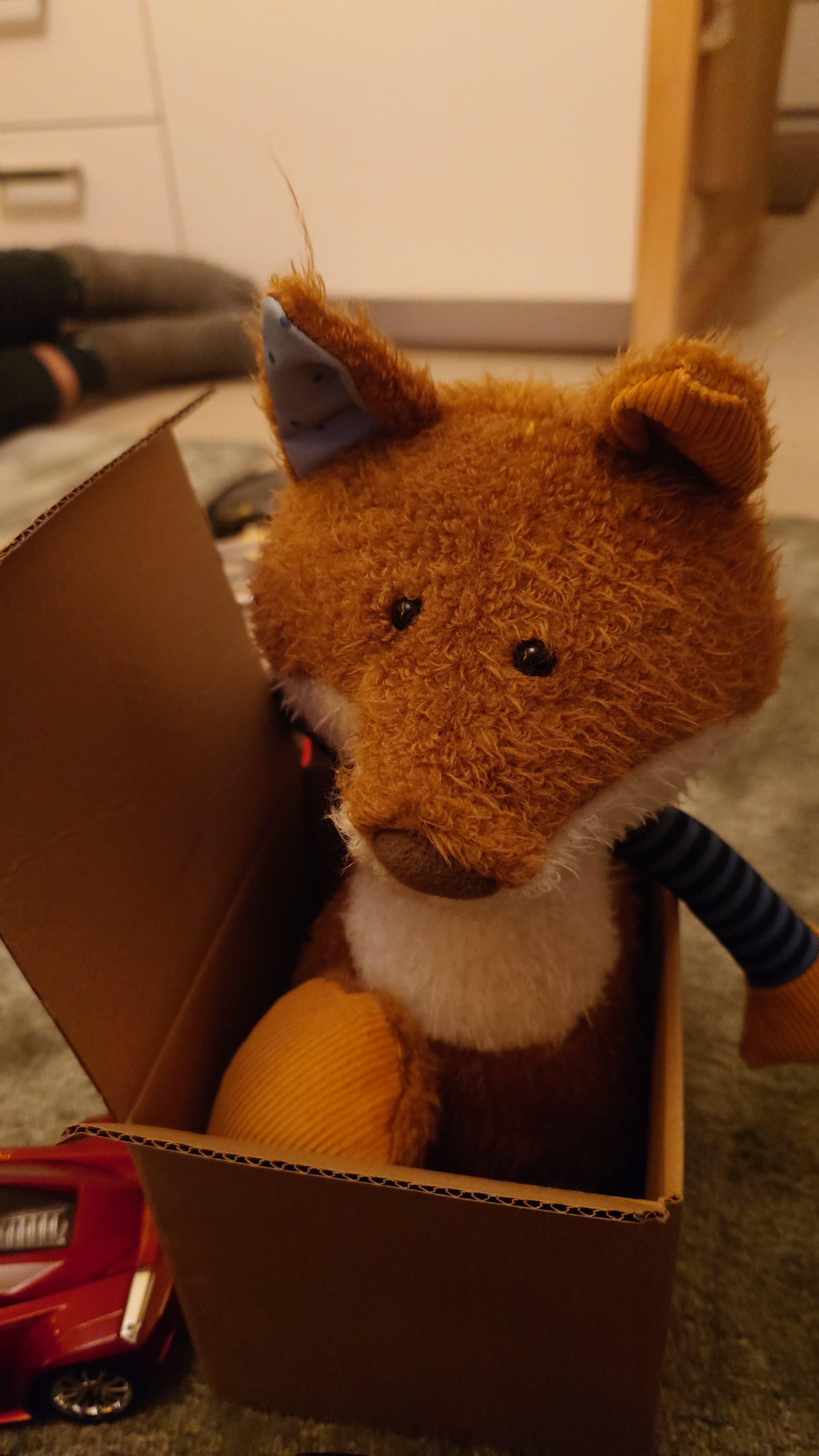
that obv is infused with great taste for cars

awwww look at that rascal ![]()
6 Likes
had some good laughs with this short list of bullet points retelling the 2024 Indycar-Season up-n-downs, dear god…
1 Like
2025 - new year, new blood, new battles:
… errrr what?
![]()
3 Likes

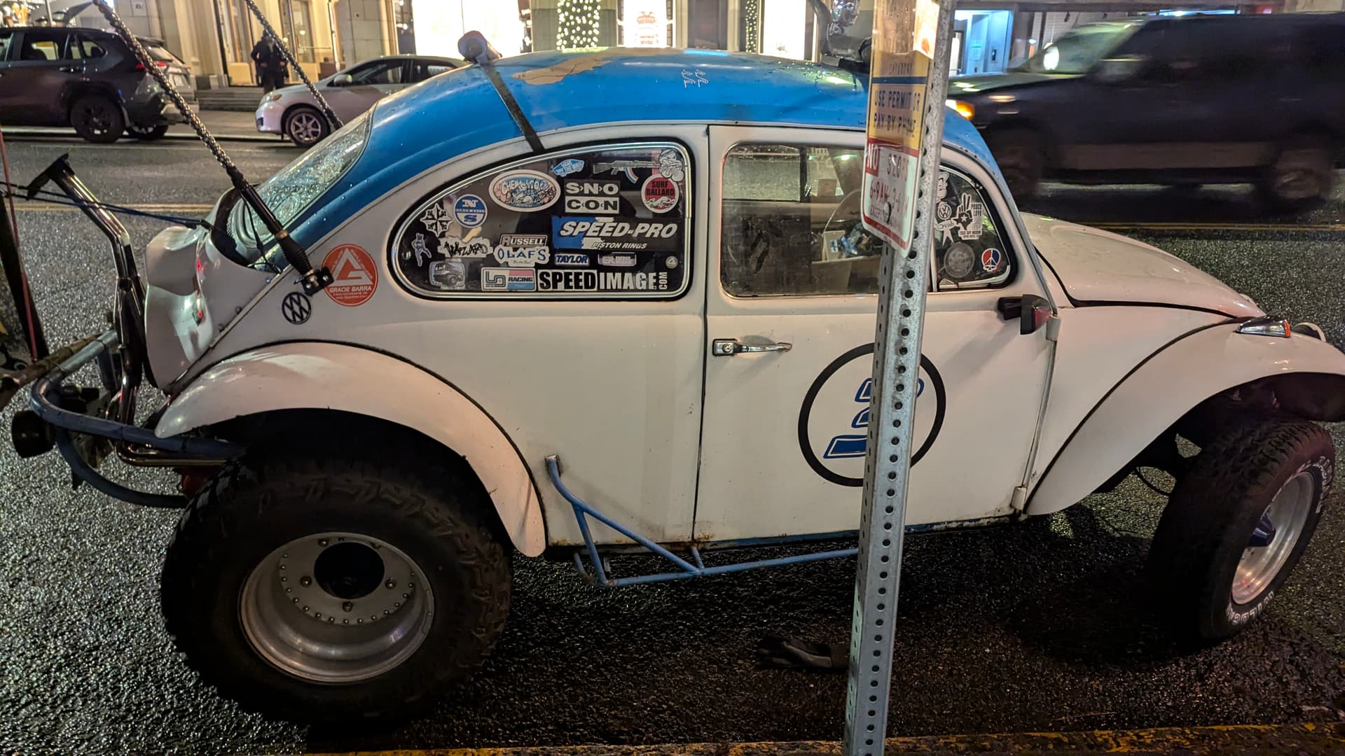
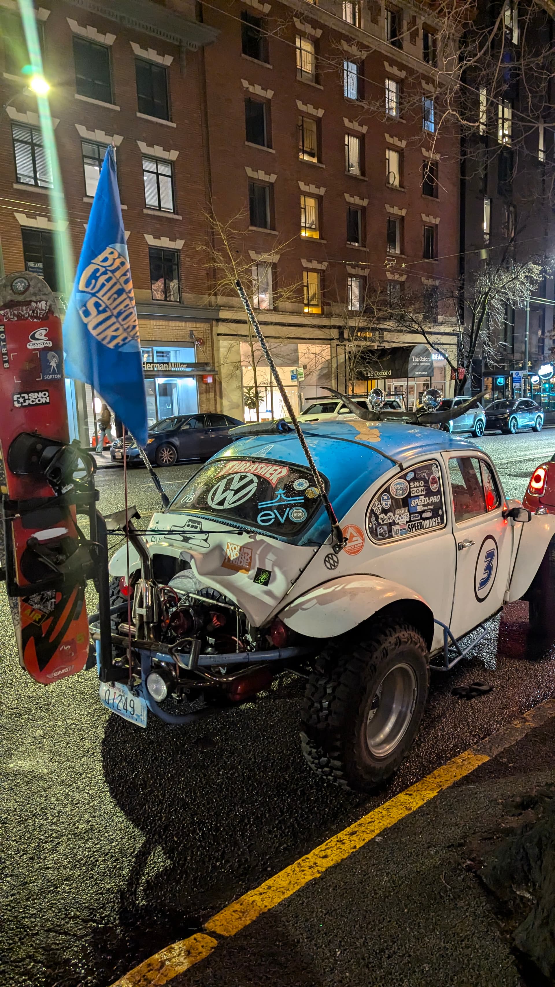
Herbie, is that you? What did They Make You Do
![]()
1 Like
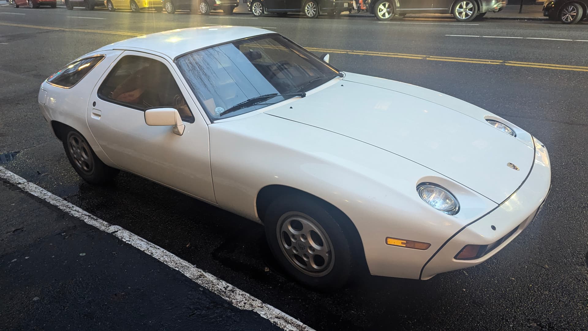

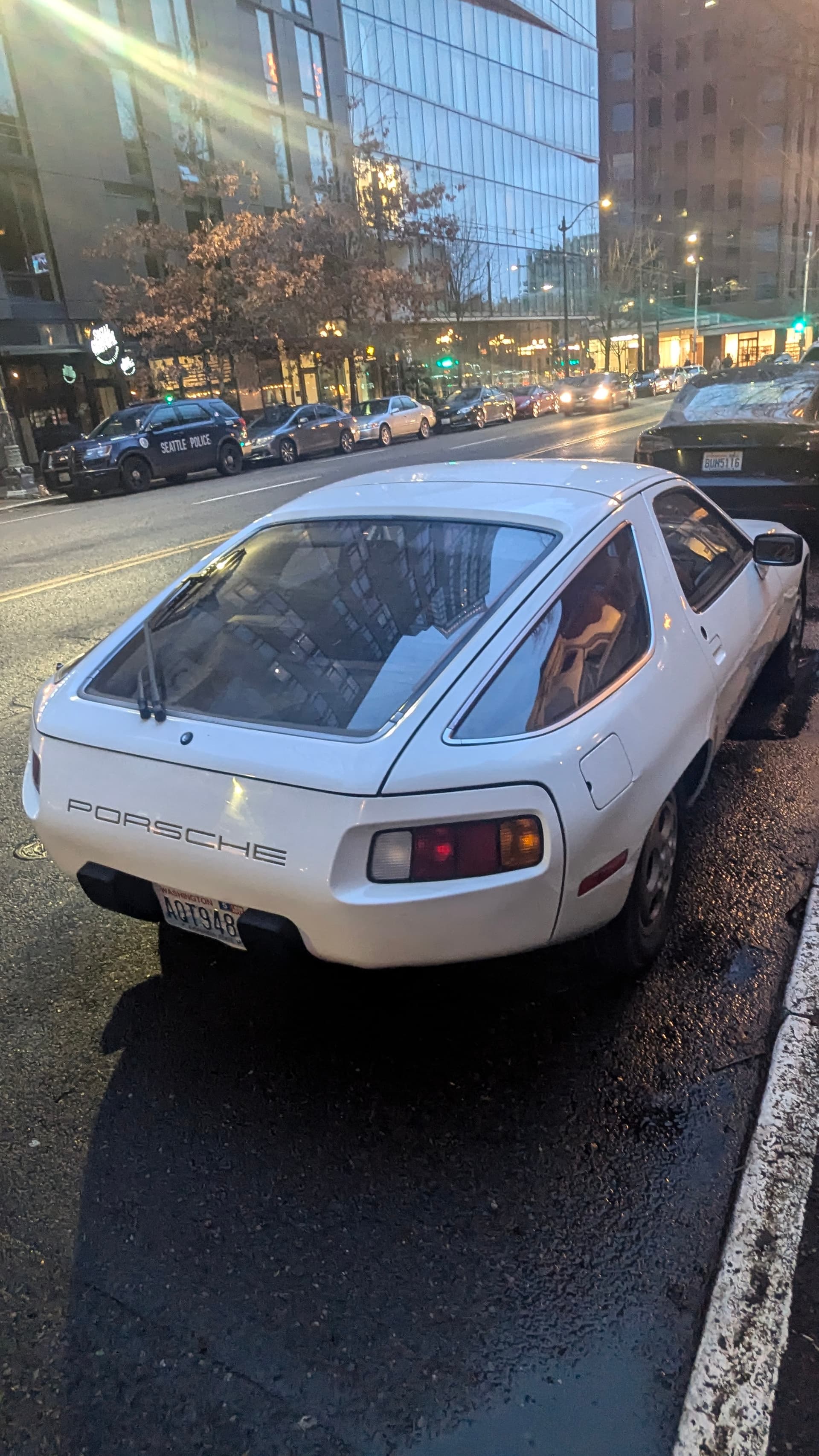
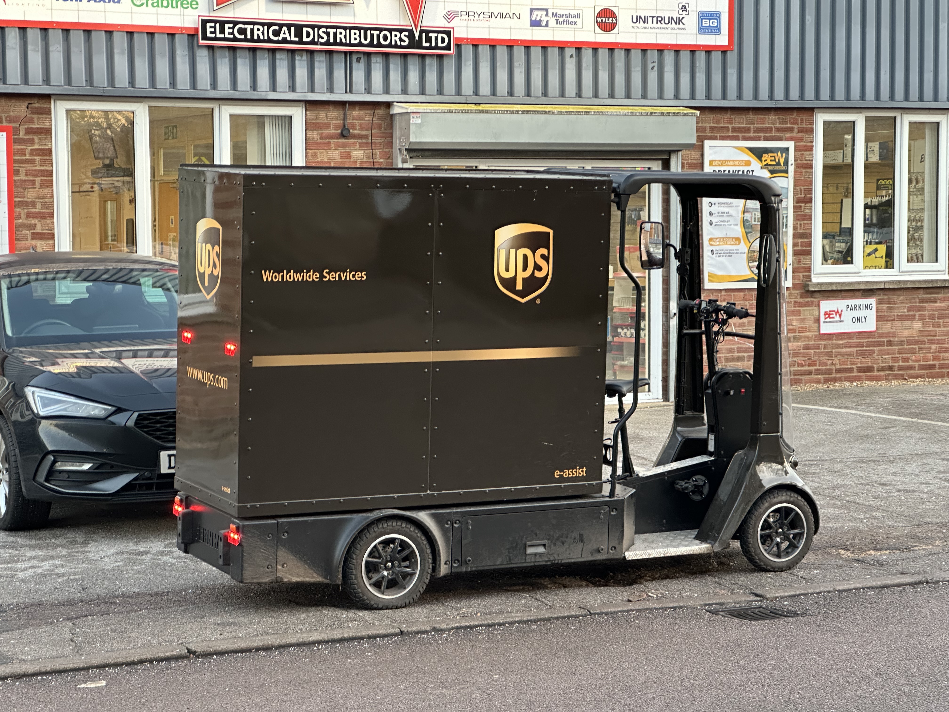
ohhh such a nice 928 ![]()
2 Likes
GOOD CAR
1 Like
Yo
sharevari intensifies
Meanwhile, in Tech-land:
Hey! THE SONY CAR IS FINALLY RELEASED, DID THEY CARVE IN AND SCRATCH THAT BORING OLD SEDAN AND RELEASE A GRAN TURISMO CONCEPT CA—
Ah… oh.
That’s… OK, i guess?
1 Like
i really, really dislike touchscreens in cars. too bad this is the way they all seem to be going
7 Likes
It is!
And what strikes me as a huge, if not MASSIVE surprise is that Lexus seems to have gotten it right by accident with the UX — don’t close the tab, give me a minute!
… still here?
OK, Elevator-pitch time:
Right by accident, because:
- physical buttons
- touchpad instead of Touchscreen (i’ll explain why later*)
- clear delineation of user interfaces into different zones.
… and of course they had to carve in and replace it with a touchscreen and invalidate some clever thinking in the mid-lifecycle refresh, because… no idea why. Not that these have been flying off the shelves like crazy before or afterwards.
So, guess it is “Explanation time” then:
Yes, the touchpad is a pain in the asssss-phalt to use — at first, you learn one important thing though: If you need to use it for more than just clicking once or twice - stop, do your thing, continue driving.
Are people doing that? — good question, idk.
Why did i mention delineation of interfaces:
There’s a vid where the vehicle engineer explains the user experience ( ![]() ) concept, which in short is focussing on three seperate zones:
) concept, which in short is focussing on three seperate zones:
- Steeringwheel+Pedals for driving
- Climate Controls
- Media + Navigation (Media-Controller + Touchpad)
Edit: now with pixxx
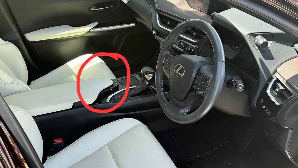
Media controller and
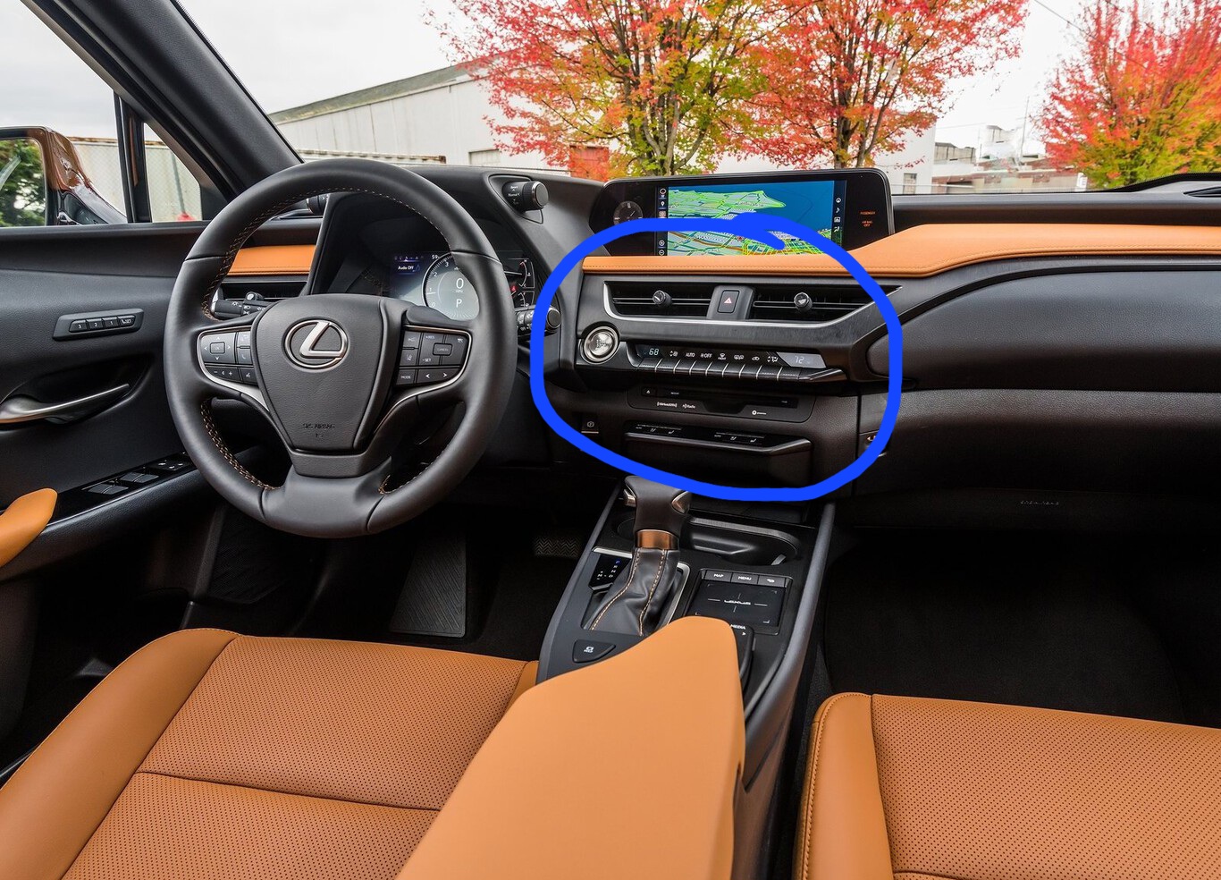
Climate controls
And what i learned after a while is that when you do the same operation in one of the different zones, the visual feedback is depending on the context:
If you skip a track with the Media-Controller (physical button), you get no visual confirmation in the HUD. If you use the steeringwheel-button though, you get a visual confirmation + the track title displayed in the respective section of the HUD. If you toggle through the distronic-cruise-ctrl settings, it displays the chosen level in the HUD, and in the assorted display to the left of the speedo.
These are subtle/minor things, granted, and most will never consciously notice these things, but you can tell that some UX engineers put some thought into it that … never went anywhere.
![]()
2 Likes
https://www.caranddriver.com/features/a63305695/john-phillips-the-best-odds-mazda-mx-3-gs/
“People get fired for shit like this.”
3 Likes