
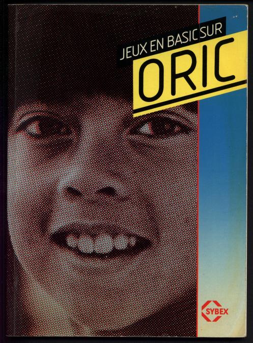
was looking at some covers for older home computer games, so many bangers. i don’t entirely know if these would all count as “designerly” but if any of these don’t fit the theme i can remove 'em.
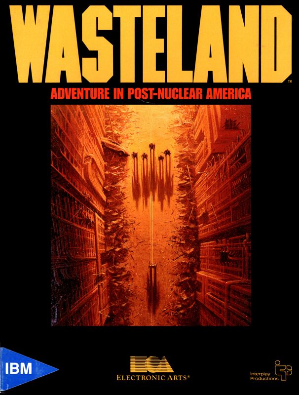
these picks are probably the equivalent of someone asking “show me some cool paintings!” and then someone posting the mona lisa, but wasteland has to have maybe one of the best box arts i have ever seen. would legitimately hang this up as a post in my room. and yknow what i probably could and should
and thracia 776’s box art is just so good for reasons i cant really pinpoint lmao
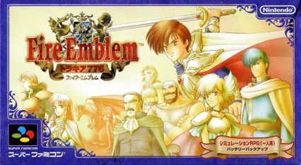
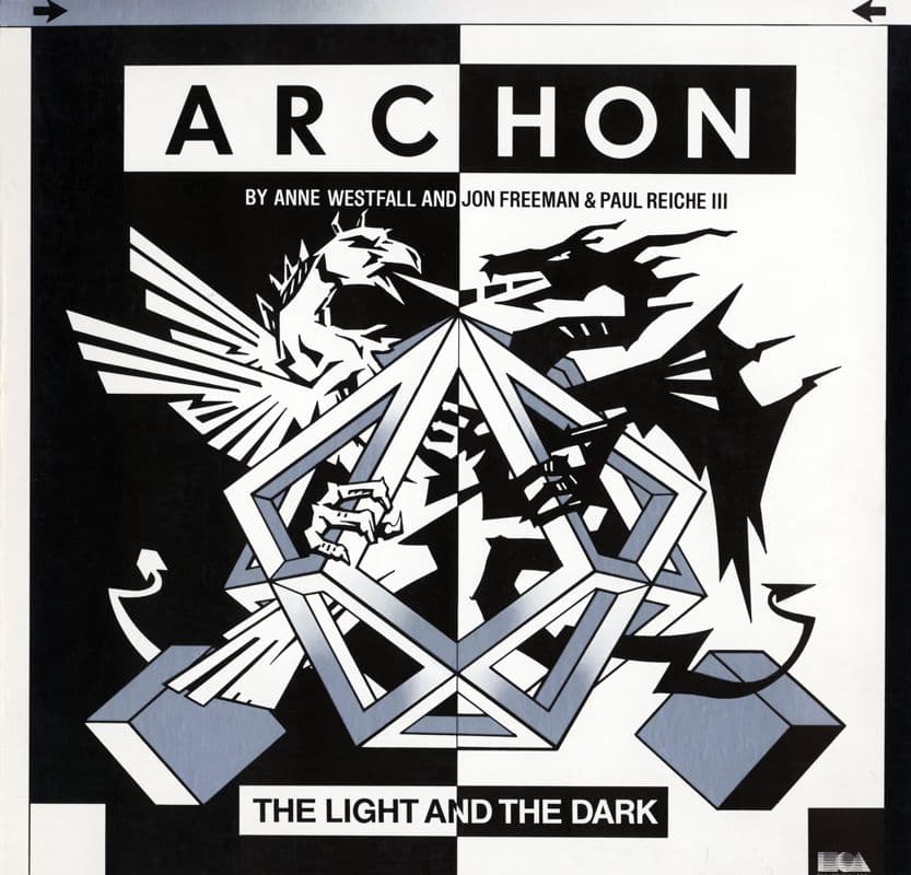
I like the curve it draws across the picture with the guy’s cape and the tops of the other characters
Is this not just the dope box art thread again
What was that website with 3D PC game boxs?
i feel like “designerly covers” with a general template of the ones provided in the OP is a fair vibe to build off. there’s not going to be a hard line for sure.
maybe what makes a cover designerly is that it depicts something potentially tangential or even unrelated to information regarding any function of the game and instead tries to present an aesthetic framework, a gesture of implied creative intent. a normal cover tries to provide you with more or less functional information about the game-as-commodity, whereas the designerly cover tries to invoke aesthetic context or aspiration.
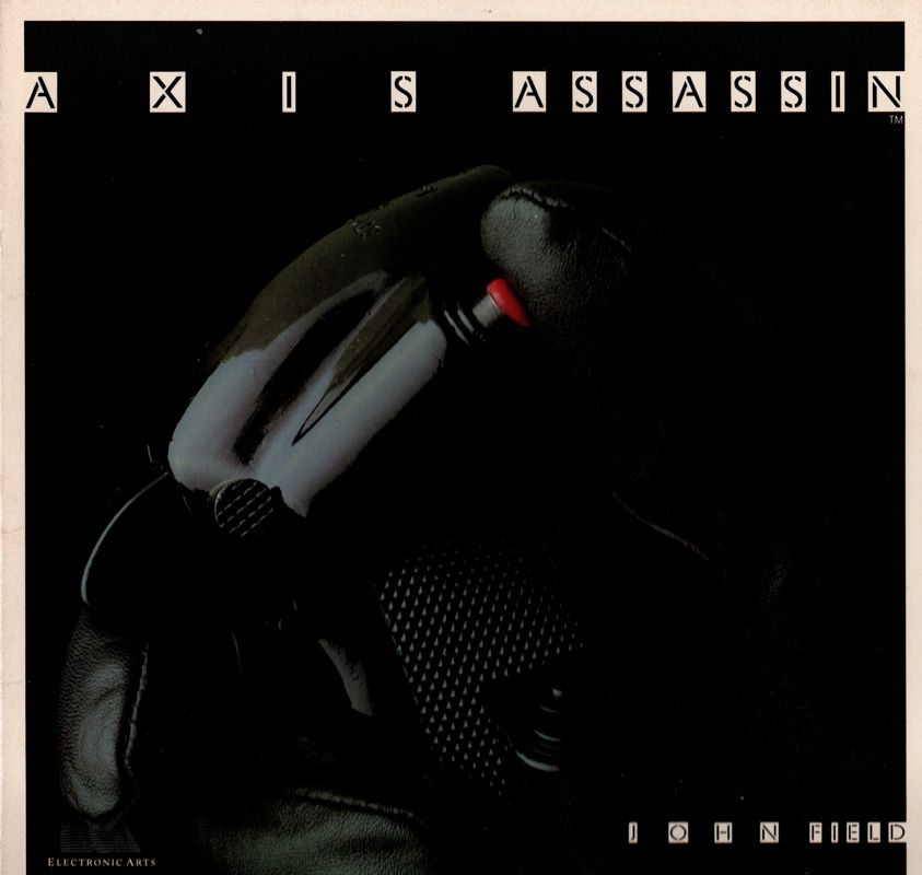
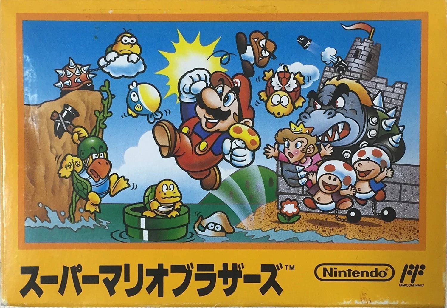
e.g. this very obviously is a dope box art, but i wouldn’t think of it as a “designerly cover” if that makes sense?
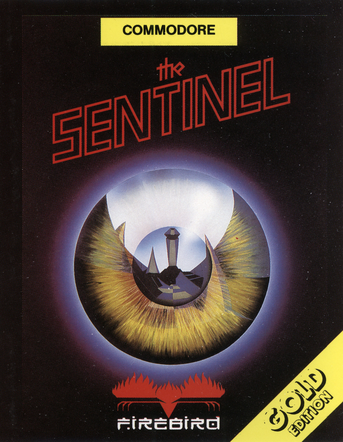
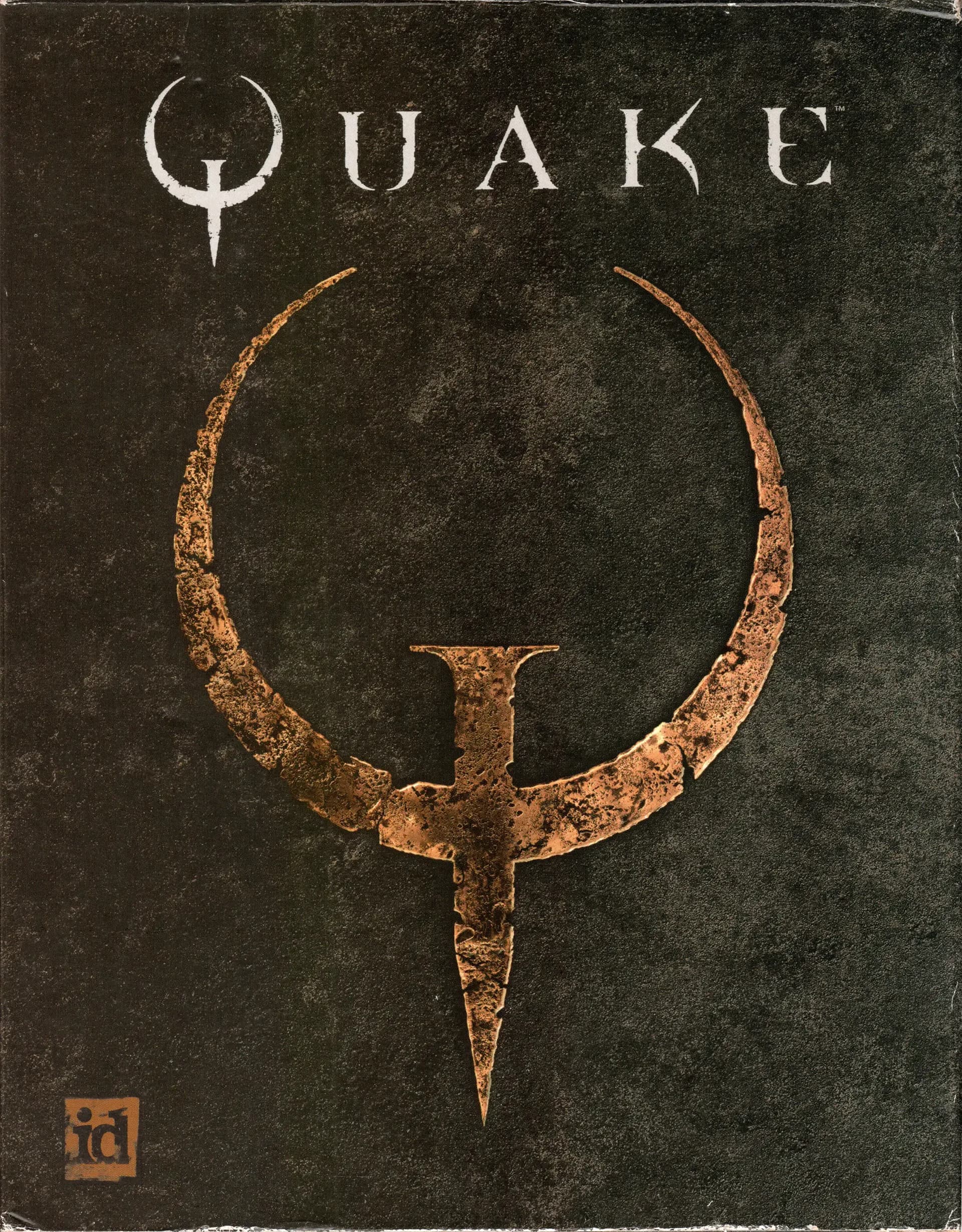
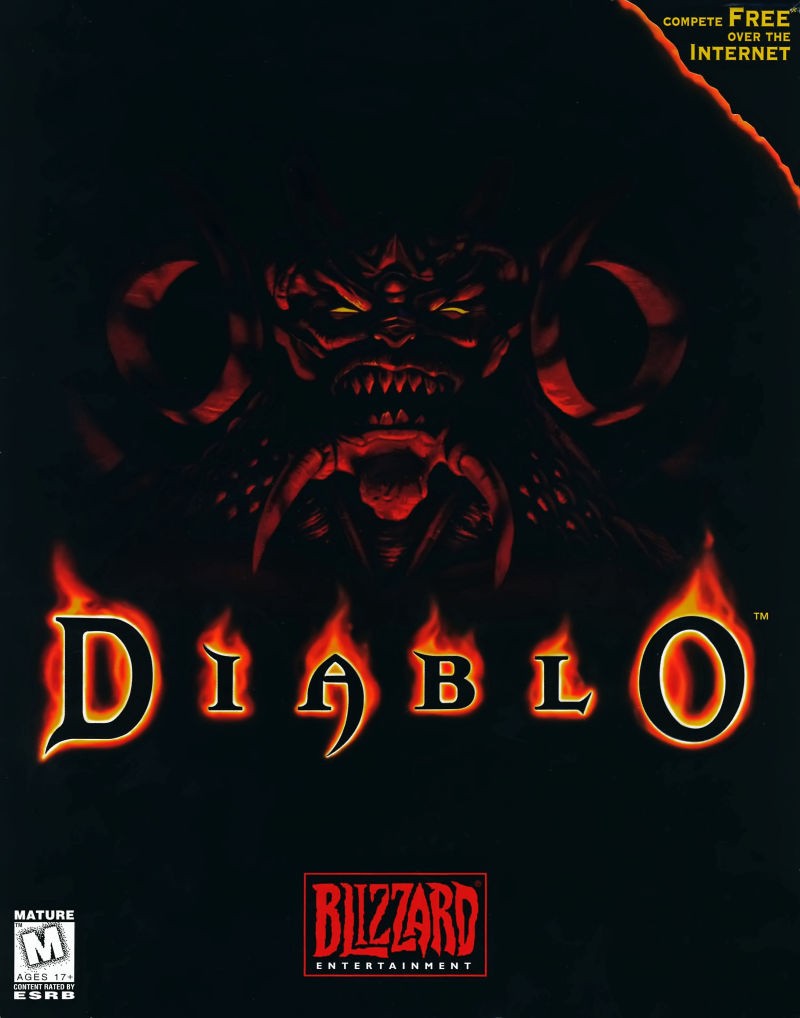
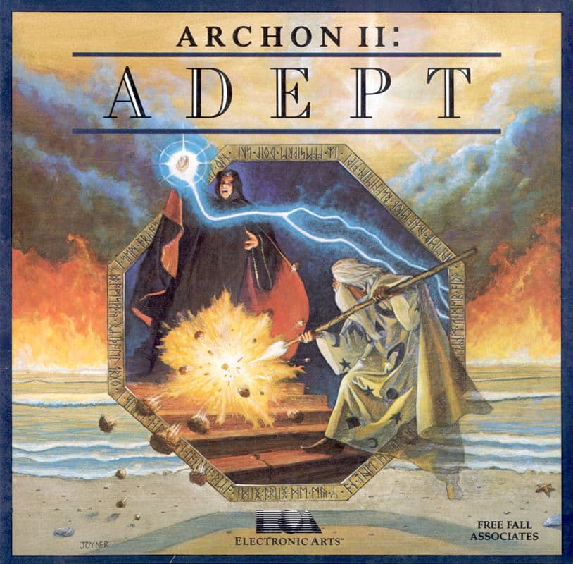
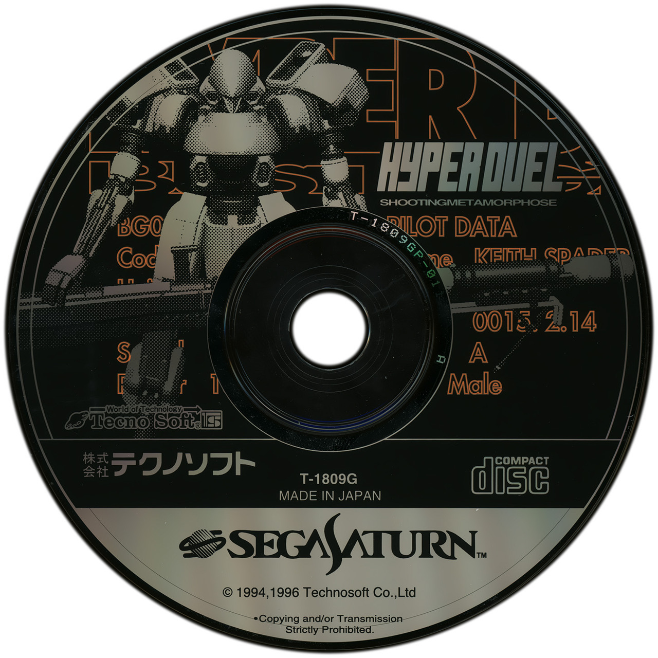
just an awesome video game box art.
@offalynne please correct me and tell me i ain’t shit if this is trash
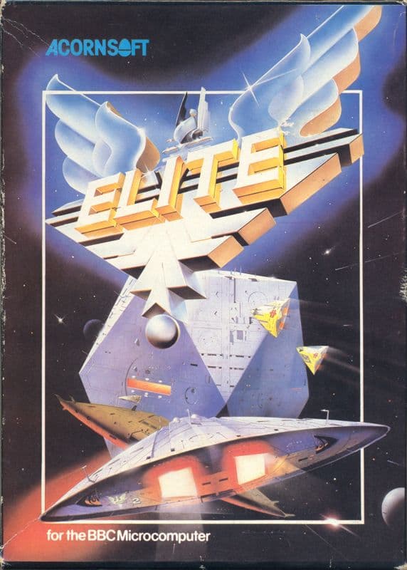
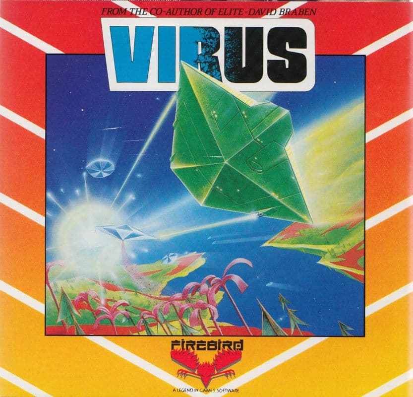
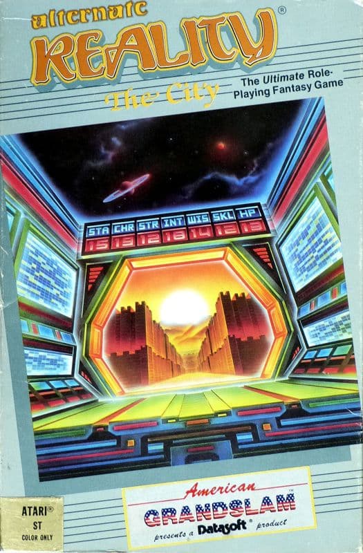
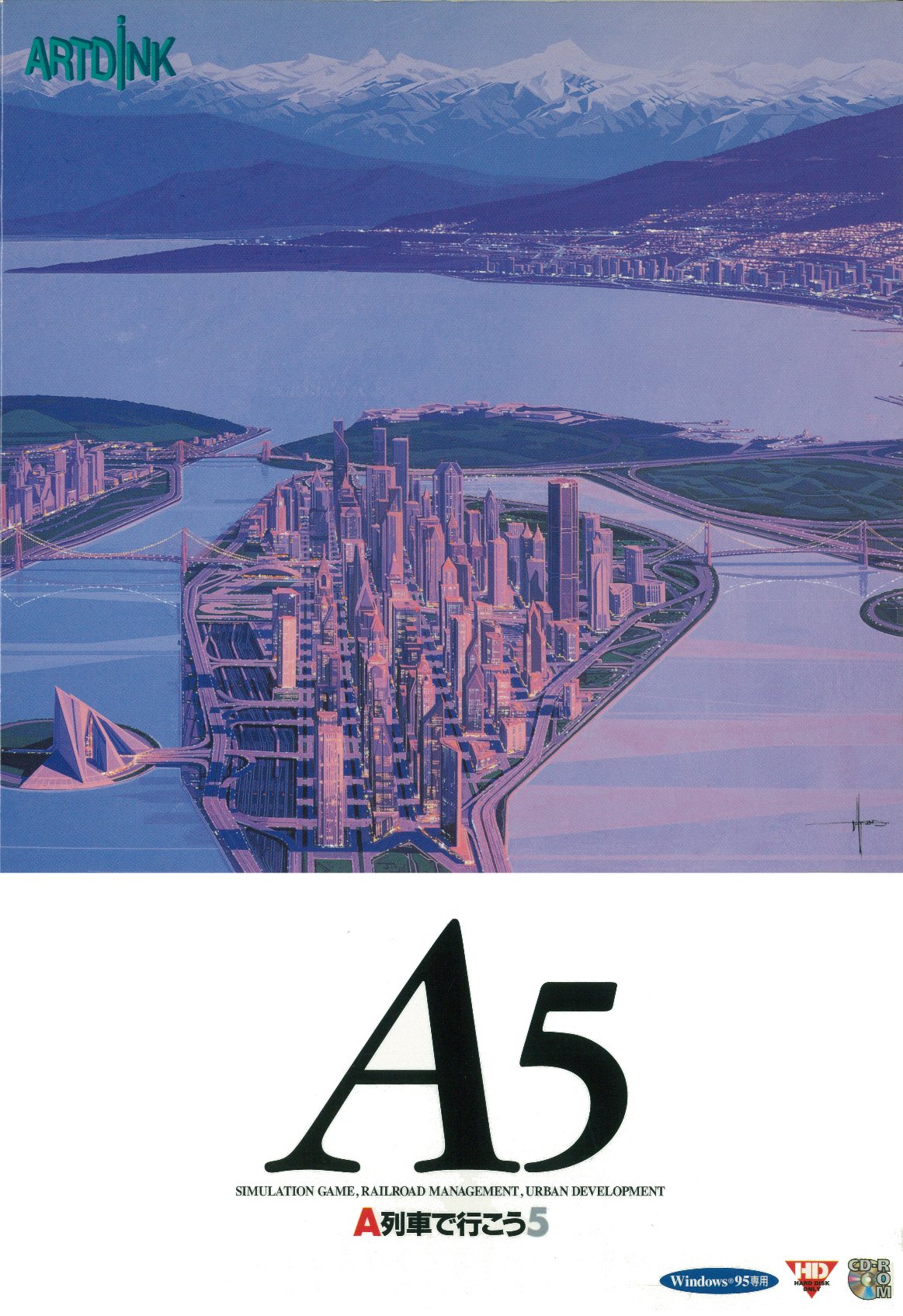
edit: as a more detailed breakdown of the ones i posted, i’d say Elite, Virus, and Alternate Reality: The City are the least designerly, although they are close enough for me to qualify. they fall more along the lines of presenting functional information about the game, but i think they still serve well enough as aesthetic framework. it’s definitely a spectrum. as far as most designerly: the 3 offalynne posted are very strong examples. the a-train 5 example swarm posted is archetypal too, i think.
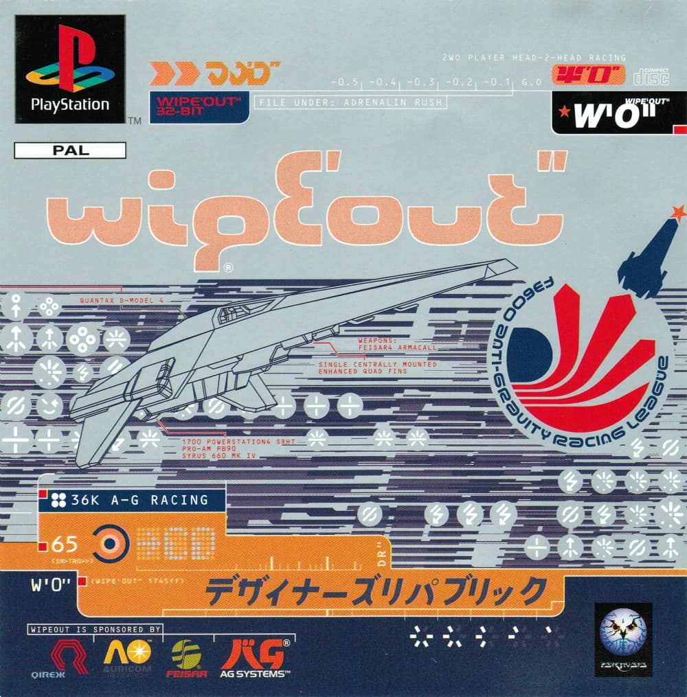
wipeout is cheating since it was literally designed by the firm “designers republic”, but it also seems way more aesthetic-context, implied creative-intent than functional.
hopefully any of this makes sense! offalynne may have been thinking of this differently
i put ‘otherwise’ in the subject line to preemptively soothe fellow neurotic posters but alas it did not work
truthfully i forgot about that other post but i think this brief can live on its own, to be interpreted broadly
but. yes, exactly
Alrighty, I can roll with that