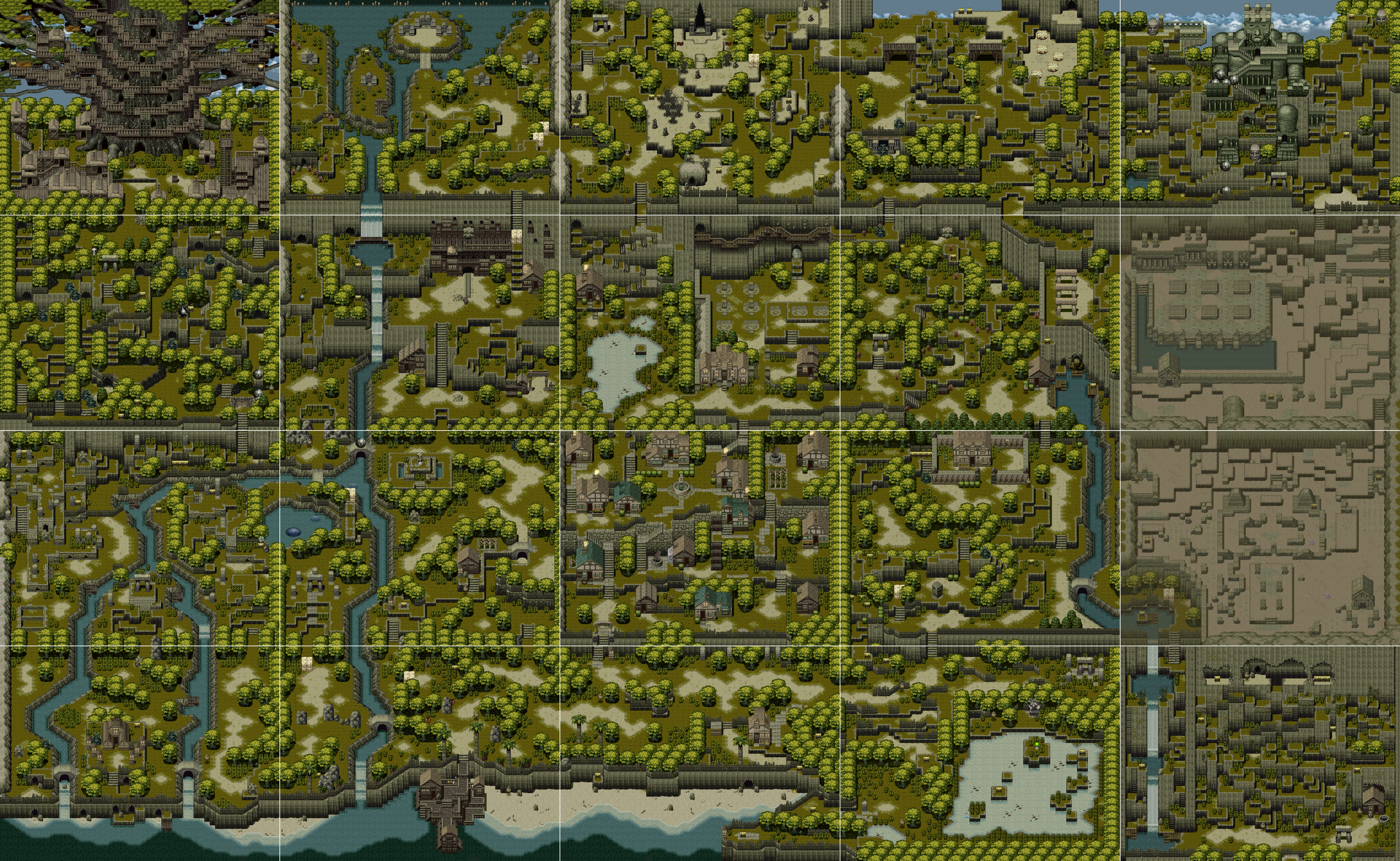
Screenshot maps showing an entire game or area

^ Dr. Who and the Mines of Terror

^ Soulless

Click on these to enlarge them, obv
Screenshot maps showing an entire game or area
^ Dr. Who and the Mines of Terror
^ Soulless
Click on these to enlarge them, obv
these were my favorite things about early Nintendo guide books
these were my favorite things about videogames
All of the Rondo maps here: http://www.castlevaniacrypt.com/rob/maps
Oh wow, it’s like a little bite-sized version! That’s fantastic.
Koholint is so crushingly good. Just look how compact and dense w/ detail it is, and yet it not once feels small. My favorite videogame overworld probably.
I agree. I remember, as a kid, noticing how the water flows from the mountains, through the rapids, into the lake, and out to sea, coherently.
I’ve been replaying this last lonely month and I think their dungeon design is even better. So much teasing within the bounds of a small square screen, so many overlooks and bridges and flooded passageways with such a limited palette. Level 6 (FACE) is incredible for this:
My only complaint is how much space the castle takes up in the middle of the map. It’s barely used and doesn’t pull the multi-entrance tricks other screens do, so it doesn’t even feel particularly large.
totally agreeing w/ all y’all itt. also i’ve heard that it feels more dream-like and cool to play b&w but i love the garish palette so so much? and the way the ‘blank’ colour is that off-white. the pokemon GBC card game did that too and it made for great contrast when actual white was used
i think one of the things i have trouble with when trying to figure out scope in my games is that i’m always torn between my desire for detail/interconnection and wanting to recapture that blue-skies, world-trotting adventure feeling i got from old RPGs–it didn’t matter to me as a kid that ff1 was a barely-designed grindfest because you could literally walk across continents, stealing treasure from ruins and selling it in a town on the other side of the world; it blew my mind
Yeah as someone who dabbles in rpgmaking and still vainly hopes to make one someday, i feel that.
ive always preferred the color version of Link’s Awakening but its also the one i grew up with.
i think its instructive to compare Koholint w/ Holodrum & Labrynna (the overworlds from the Oracle games)
Dont get me started on the dungeons in either of these games though. for some bizarre reason Camelot decided to have rooms be several screen widths long instead of packing better design into a single screen, totally playing against the hardware (whereas Link’s Awakening leans into it and is much better for it)
I like that the master sword in Holodrum sits outside of the otherwise perfectly square map. Feels like you would have to glitch to get there.
forget what i said about LA’s garish colours
Remember that these palettes are filtered through the murk of a Game Boy Color screen, so they don’t look quite right on our backlit monitors.
Alundra’s map bloody owns. Love all the cliffs and stairs and waterfalls. Really has a sense of the whole map being one big mountain. And that little pier on the water is brilliant. I’ve never even played Alundra but I look at this map often. It’s too big to upload so here’s a link instead. http://www.vgmaps.com/Atlas/PSX/Alundra-World.png
I feel the exact opposite! But I don’t want to crap up this thread with a Zelda argument so feel free to disregard my unsubstantiated rebuttal
We don’t have to argue about it! I’d be happy to read your counterpoint if you ever feel like expanding on it. I’m replaying the Oracle games now, it had been years since i had when i made that post, so my opinion might have changed anyway. I remember Ages having some pretty long-winded dungeon puzzle design that i wasn’t as into, though since i lost my copy of Seasons when i was a kid i also played Ages a lot more, so i’m more familiar with it and less so with Seasons. Maybe i’ll like Ages more now, or maybe i’ll think they both suck!


