Hi all,
How would I actually go about like making a HTML element with the same height and width of the phone/device that a site is being opened in?
Post any other app dev questions here.
Thanks SB
Hi all,
How would I actually go about like making a HTML element with the same height and width of the phone/device that a site is being opened in?
Post any other app dev questions here.
Thanks SB
You can try:
<meta name="viewport" content="width=device-width, initial-scale=1.0" />
with
.element {
  width: 100vw;
  height: 100vh;
  display: flex;
}
height: 100dvh might work, too.
Sorry can I ask about the meaning of that meta element
? I have studied some cs but when it comes to web stuff I am self-taught.
It’s for scaling on mobile.
if you search for “some html or JavaScript thing MDN” usually you will find a good explanation
at first i thought this was a question too small for its own thread but actually i totally ended up just fudging this test on freecodecamp coz something about the sandbox was throwing off the vertical scaling. thanks for asking rq, thanks for the answers team
yeah thanks for the replies
I am muddling through with
myCanvasElement.width = window.innerWidth
/* and */
myCanvasElement.height = window.innerHeight
seems to be working ok
Yo what’s the code to make the browser do a notification to the phone
No I ain’t gonna search that junk up bcos ya’ll are the only nerds that I like/trust
to get it to work on a phone is an “hourly rate quoted” sort of thing
Do you guys reckon the card deck effect is done with just css?
i can confirm that interacting with push notification services is a pain in the ass and also costs $100 / year if you want to send them to apple devices
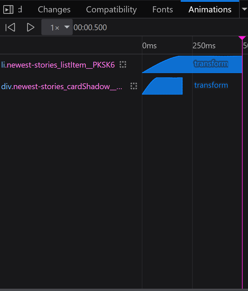
those spinning card effects do look like css transitions to me, if you look at the effect with browser dev tools open though you’ll see that classes get added to and removed from the elements as you mouse over different ones, meaning there is also javascript being executed
there’s this class called “newest stories active card” except with cryptic punctuation with this associated with it:
  .newest-stories_listItem__PKSK6.newest-stories_activeCard__mi_LI {
    z-index: 10;
    transform: var(--newest-stories-active-card-transform,"none");
    --card-meta-display: flex;
    --card-width: var(--newest-stories-activecard-width,100%);
    --title-font-size: var(--text-2xl);
    --title-line-height: var(--leading-8);
    --summary-font-size: var(--text-base);
  }
}
where newest card active card transform is a css variable specifying translation, rotating, and scaling, but the dev tools are showing it in a little tool tip that idk how to copy and paste from
i recommend fucking around in browser dev tools to inspect it and replicating it on your own
Any tips on getting phone camera to work on an iPhone and iPad?
Thanks, yeah I want to do a code tear down of that whole lil effect
yeah it’s CSS
should be fine
Sorry just replying to myself for future reference
https://stackoverflow.com/questions/68797537/accessing-the-camera-in-ios-safari-on-an-iphone